
Swipe Revolution
Swiping Mobile Game | IOS Mobile Game currently under development by a team of designers and a developer.

Swipe Revolution is a real mobile game currently under development by a team of 3.
Game Concept
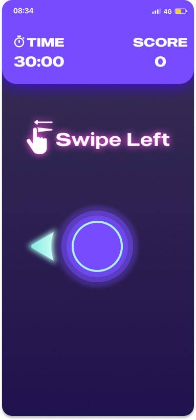
Swipe Revolution is a casual arcade game style that allows users/players to build up their scores by swipe as fast as possible in the correct directions. As users collect more scores or hit the high score records, they will gain coin rewards that allow them to exchange or upgrade their game avatar and unlock more things within the game.
Although we are still also working on further game mechanics and the overall game design experience, we can only show some parts of the project that we have worked on.
Goals & Objectives
Design a real mobile game for IOS
Launch the app at apple app-store
Design further game mechanics and overall UX
Design game UI, Visual elements and Logo
Design Game Characters (Avatars and NPC)
Complete the MVP and Develop the game concept
Test out the game
Current Status: On-Going (MVP Stage)
What we are working on right now
Designing the Game UX and Main game mechanics (Swiping Function)
UI and Visual Design
Game Character Design (Game Avatars and NPC) No Showcase Yet
Back and Front End Development for the Swiping Function
PROJECT Duration
Since September 2020
My ROLE
Design Lead
TEAM
Chira Chirakijja (Me)
Vincent Tsaikovski (UX & UI Designer)
Valerie Don (Full-Stack Developer, Founder)
UI Mood board
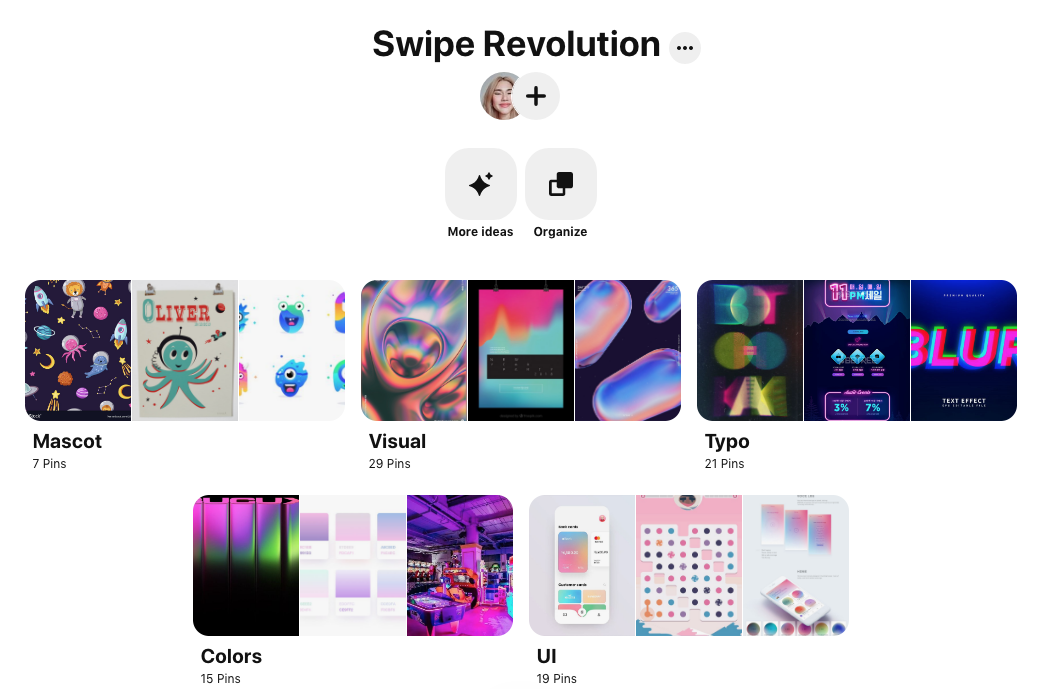
UI Kit

Game Character Design (Sketch)
We are currently in the process of designing the characters for the game storylines. These characters will also be the part of the app logo/app icon.
These character will represent as:
🐙 NPC (Non-playable Character) will appear as a game tour-guide and the mascot. NPC helps enhancing user’s sense of emotional reward and game story-telling.
🐱 User-Avatar (Customizable Character) This would be the character that represent the user him/herself. Users will be able to customize and grow along their avatar character as the game experience progress. User-Avatar also enables the game to feels more personal and rewarding.

Current Design
Currently, we keep improving the design of the product and also new different iterations. We are using this current design as shown below for early code development. As the product progress, we expect the overall design to be changed and improved further this current version.


Automata
Robot Maintenance App | Automata app gives users the ability to easily maintain and control over their personal robot

Automata app gives users the ability to easily maintain and control over their personal robot
Project Background
The mega robotic company called "AUTOMATA" has a plan to launch a new high-end security robot that would replace humans in the military, police operation, and security-related positions. The robot is also designed for private owners and business entities who wish to replace this new, highly durable, skillful, and intelligent robot over human workers.
AUTOMATA company wants me to design a user-friendly mobile app that allows users to maintain the robot and even customize the robot's system setting.
Concept
The idea of this project is to design a mobile application for a personal robot's maintenance. This project is a fictional project that will take place for a possible case scenario in the far future when robots become highly developed and wholly integrated into our everyday lives.
In the soon future, there might be many kinds of robot working in different careers. And with this idea, I wanted to design for a product that would allow a user to interact with robots.
Let's assume that personal mobile phone would still be used in the far future. Users would still need to be able to take full control over these highly advanced robots and be able to give them maintenance easily through a mobile app.
PROJECT DURATION
4 weeks
ROLE
UX&UI Designer, Researcher and Interaction Designer
TEAM
Chira Chirakijja (Me)
Paddy Donnelly (Mentor)
STAKEHOLDER
AUTOMATA Robot Company (Fictional Client)
Goals & Objectives
Design a user-friendly robot maintenance mobile app
Research on the existing maintenance mobile apps (Example. Cars' maintenance app)
Research on the existing AI mobile applications
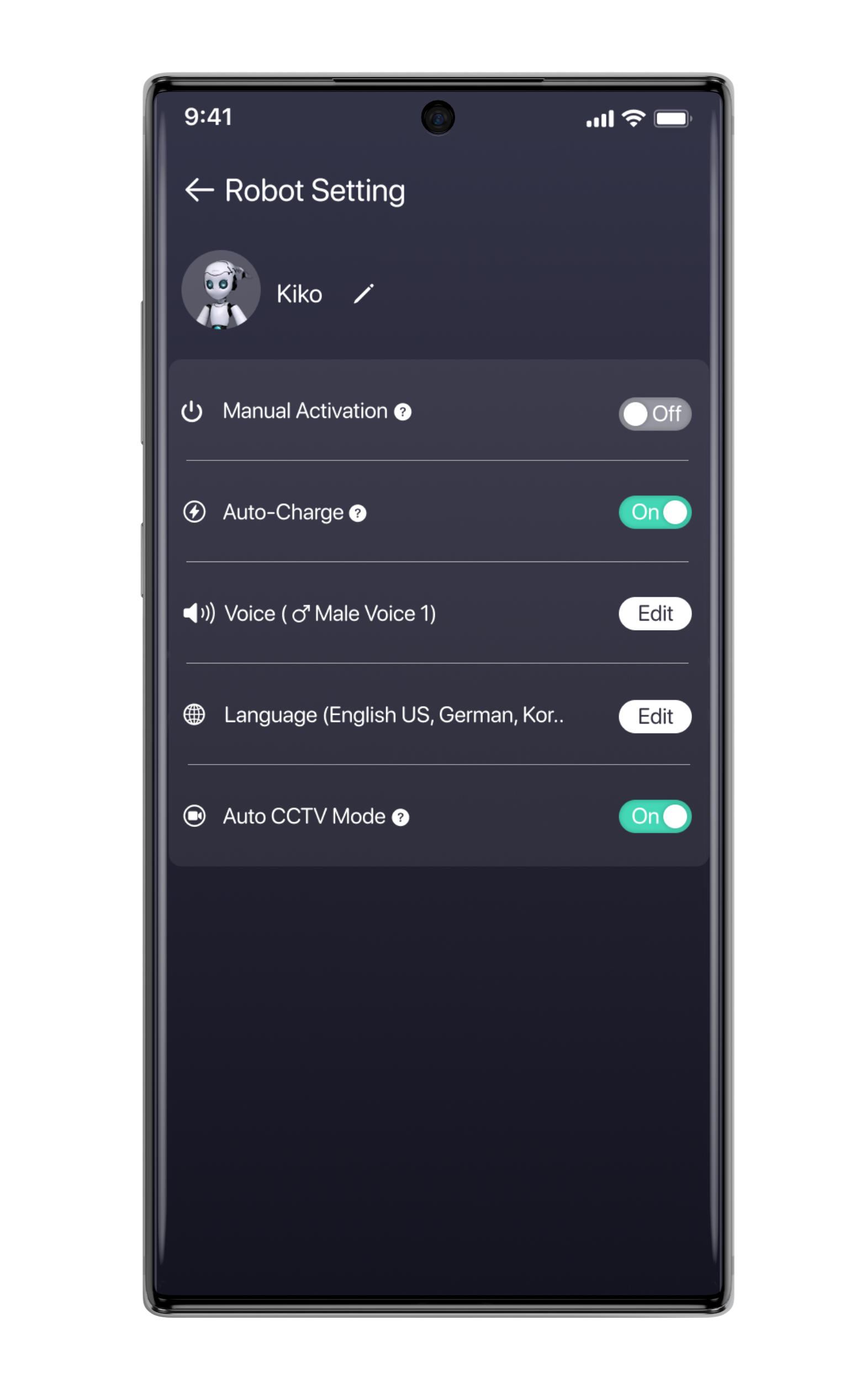
Design the maintenance setting that makes users feel in control.
Design a new logo, style tile, and UI
Define the possible target users
Test the product

Research Goals
Data Collection
Gather informations about machine maintenance apps and AI/ Robotic related apps.
How these apps work? Who would mostly be the target users?
What kind of concern would people have for robots and AI?
Design Audit (Competitors):
Which companies have a car or machine maintenance mobile apps?
Which Robotic and AI apps can I learn from?
PRIMARY RESEARCH
User Interview: To empathize and understand how target users would think about the possibility at using a mobile app to maintain and control their security robot.
Participant requirements
Both Male and Female
Age from 20 - 40 years old
Interested in artificial intelligence and robots
Have experience in using any kind of AI assistant like Siri, Google Assistant, Bixby and Etc.


Data Collection (Secondary Research)
To find inspirations and information that would support the project, I was researching how today's robotic inventions could inspire me about the project. The existing AI products that we already know (Siri, Google AI, Alexa, and Bixby), they are giving some basic guiding of why they have become accessible to users. To study about today's AI, helped me to be able to create a set of questions that I was using for user interview. I found out that the reality of personal robot integration is not so far away in the future. This helped me to be able to create further questions of "How do I create a system or product that would help users control their robots and AI easily?"

User Interviews
To find out more inspirations and understanding more about users who have experience in interacting with today's AI and robots. I conducted user interviews with three millennial participants who are the frequent users of AI products and including a home-robot like a vacuum robot.
Despite the project's concept is very fictional and is taken place in the future scenario, the insights from the interviews helped me to understand their wishes and concerns in AI and robotic products. Also, they were sharing ideas that helped me to learn how it was possible to start designing the robot maintenance app.
ABOUT PARTICIPANTS
3 Participants
3 Females based in USA
Age 20 - 28 years old (Millennials)
Have Smartphone device and any AI or robotic products
Have experience in using any kind of AI assistant like Siri, Google Assistant, Bixby, Alexa and Etc. Owning a car is plus.
Are interested in robots and Ai concepts
Interesting Insights
When it comes to interacting with AI, all user’s big concern is privacy.
All users feel that AI can be unpredictable in their behaviors.
All users agree that they would like to feel a sense of control if they would own a personal robot.
One user claimed that she would prefer to communicate with the AI products by texting more often than a voice command.
All users feel that they want to be able to personalize their AI/robotic products.
One user felt frustrated that her AI can only understand one language at a time.
All users agree that all personal robots should have an app or tool that would allow them to control and keep track of the robot.
All users have a slight fear for AI and robots but still admit that they want to own a personal robot.
All users think robots should look friendly and cute, to enhance their sense of safety. (And robots shouldn’t look too much like a human)
Persona Creation
To define and empathize better with the target users, I utilized all of the research findings and interviews to create two personas. These personas represent the potential users who would want to use a robot maintenance application to keep track of his/her robot. This persona creation has been inspired not only based on the project research, but it has been inspired by my observations from sci-fi films as well.
So I have created two personas who have different concerns and needs when it comes to owning a robot.
About the personas
Victor: Is a private user who purchased and owned a robot for his reason. He has concerns and needs for himself and his family.
Sarah: Is a police officer who only works with a police robot that is owned by the government. She has concerns and needs mainly related to her works and the safety of civilians.


Storyboard
A storyboard is a great tool to better empathize with the target user. We can see through how the app could integrate into the user’s experience. The storyboard was made based on secondary research, observation, user-interviews, and persona creation. Not only as a great tool to empathize with the possible target users, but it is also a helpful way to communicate to the stakeholder and the team to help them understand the possibility of the app existence.

Information Architecture
Product Roadmap
To start designing the new robot maintenance app, the product roadmap contains the lists of different priorities of the features that will be added to the product. I utilized the all my research collections and the list of functions that we have already used for organizing our life.

Site Map
To design how the new robot app, this sitemap works in a manner that helps me to see how it would be possible to bring the features from the roadmap list to fit into the design structure of the app. The challenge is that I had to prioritize the essential functions that would be necessary for the users to feel in-control while keeping track of his/her robot. I decided not to over-add the features to prevent the app from becoming too complex for the users. While the same time I try to balance the number of features that I put into the app to make the app becomes truly useful and functional.


User Flow
In order to learn how the sitemap would work, I created 3 usage case scenarios. Each scenario gave me a better picture of how a user would go through step by step. Not everything from the product roadmap and sitemap was able to fit into the design, so the user flow helped me to prioritize what necessary for the feature.

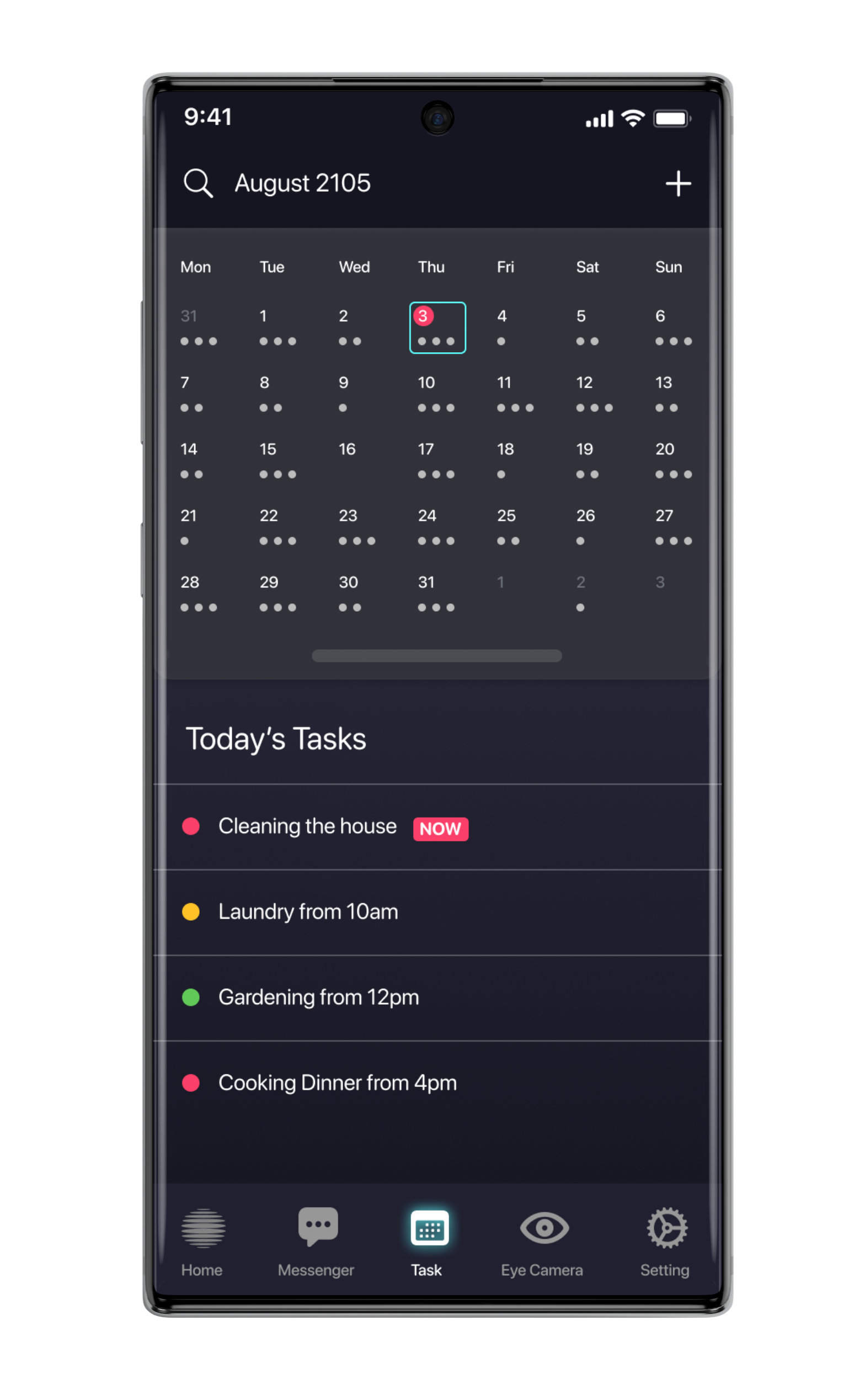
Low-Fidelity Wireframe Sketches
To create the visual structure of the product, l utilized the product roadmap, sitemap, and user flow to help me with the sketches. I also obtained inspirations from our everyday applications and products such as text messager, calendar app, app store, camera app, and RPG gaming experiences to help with different features of the design. To make the design turn out as user-friendly as possible, I carefully picked the design patterns that I believe are the most common and familiar for most of today's users.
However, I used Low-fidelity wireframe as the first draft of the idea of how the product would be built. I transformed the low-fidelity into the digital version (Mid-fidelity version) to have a better look at how I could improve the wireframe further.
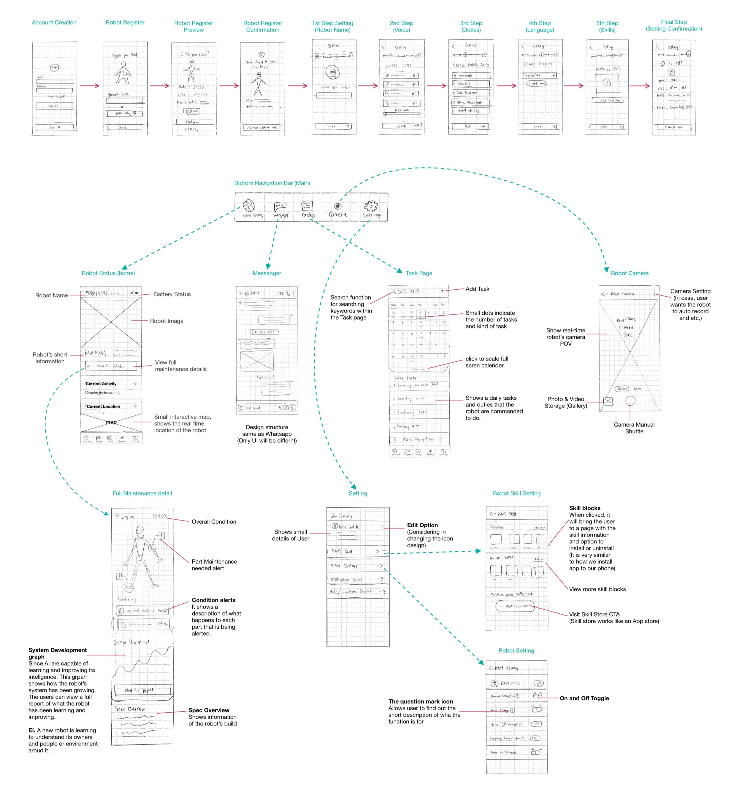
Click to view full-size
Interaction Design
Mid-Fidelity Wireframe
As I transformed the low-fidelity wireframe sketches into a mid-fidelity wireframe, I have made changes in terms of elements and layout. I have re-ordered the element layout and re-prioritized what’s essential in each feature. The major transformation from the low-fidelity version into this mid-fidelity wireframe is the “Home screen.” It is where I simplified the essential features into one simple screen function.

Click to view full-size
Mood Board
To create the visual style for the product’s UI, I started to gather inspirations since I began the project very early on. What I have learned to develop an effective and solid mood board for UI is that it was the right thing to start very early on when the idea was still very fresh. What I see is that Moodboard usually needs time to develop, and it should not be something to rush.
What I did was that I first gathered images into one single random category, and afterward, I created more different segments for re-selecting the references into specific categories.
After the moodboard became solid enough, it has helped me to save a lot of time at creating style-guide, UI Kit and logo design. It is important for designers to be sure enough about the style that he/she will be creating.

Logo Design
As the project is an organic fictional idea that needed to have a new brand-image. I tried to come up with the logo that would suit the style that I have come up with the mood board. It has been a big challenge to design an iconic logo for this project as I have learned that logo design usually needs a lot of time and a lot of experiments. Sometimes the logos required references to help with inspiration, but it still can turn out un-iconic or even too unoriginal. Occasionally a designer herself/himself may not have a full ability to create what exactly they want.
For my logo design process, I have been experimenting with oval, circle shape, and 3D effects on the Illustrator. However, since the timing was limited, I decided to use a sphere shape with the flat ovals stacking together as the project's logo. However, before I wanted to use another design of the blob-shaped sphere but it still looks too similar to the original reference, and I decided not to use it at all due to the copy-right concern.
Final Logo


Logo design experiment by laying out shapes

3D Revolve Effect Experiment on the Illustrator
For the font logo, I didn’t design it by myself, but I chose to use the existing sci-fi font that is available for non-commercial use.


Style Guide
To create a solid style for the UI, the work has to be done in the mood board. After I created a solid mood board that I am satisfied, I re-selected the images that believed would be the primary representation of the UI Style that I wanted to go for.
I got inspired by the colors and visual effects that the references hold. I created the color palette based on the image elements, while I was also considering adding more colors that were only useful for specific functions and enhancing accessibility.
The approach that I have for the UI style guide is that I usually keep the style guide slightly flexible and easy to be changed. I still believe that in most cases, designers must be strict with following style guides. But I do not think that styles should not always stay the same due to the changing style trend. UI Styling is essential at creating a sense of connection to the users and evoking their positive emotions such as “Welcomed,” “Secured,” “Friendly,” “Up-to-date,” etc.

UI Kit
After careful consideration of the style guide, UI Kit is a tool that I usually keep things strict and precise. I see UI Kit as a tool that allows designers to follow for their projects without having to make more changes in terms of UI style. It is different from the style guide, as it is something that designers use for working together as a team. Designers can quickly pick the elements to apply to the high-fidelity design of the product without having to worry about being unsure about the given style for the UI.
Before I decided that UI Kit is ready, I normally try apply to elements together on the wireframe and then making final decisions on what colors, shade or element style I really want to stick with through out the whole project.

Iteration & Implementation
High-Fidelity Prototypes
After I became sure with the UI Kit style that I wanted to stick with, I have applied elements from the UI kit into the duplication file of the final mid-fidelity wireframe. Usually, I do not make any such changes in the design structure with high-fidelity, unless necessary.

First Version Prototype
Above is the first version of the high-fidelity prototype, where I decided to make more changes in terms of robot visual representation. What I realized was that visual presentations and even colors can evoke the user’s sense of connection to his/her product.

Robot representation
However, I changed the robot presentation from manly looking one into a more soft and friendly-looking robot. As I have discussed with my mentor that the orange robot quite appears too intimidating and scary. And the purpose of this project is that to crate the sense of control and safety for users to interact with his/her robot.

Final Version Prototype
After making a change with a robot representation, I decided to add more screen functions to the prototype by choosing to create more screens that serve the main important tasks that the users would mostly want to use. I tried to make the prototype feels as realistic as possible for a usability test.

Different themes for user’s personalization
Since I was well aware that I want to make sure users would feel personalized and connected to the robot, I added an option for users to change app themes.
I came up with another three different themes that I believed would evoke a sense of friendliness while considering the readability of the themes.
These themes were inspired by Japanese sci-fi kind of aesthetics. I tried to keep the theme cute and fun yet feels high-tech.
Robot image references:
Orange Robot (https://elementza.com/)
Main White Robot (Chogokin Drossel Action Figure)
White Small Robot (Musio Robot)
Usability Test
To measure the usability of the product design, it is essential to conduct the testing with the target users. It helps revealing weak and strong spots of the design which is great for a designer to know how he or she can improve the design. I used the final versioned high-fidelity prototype to test out with 3 users.
Participants
3 Participants
2 Females, 1 Male
Age Mid 20s
Test Method: In-Person (with Figma Mirror) and Remote Test
2 Participants were new to the project
1 Participant was recently interviewed for the project
Test Objective
To spot the features or elements that create fruition or confusions to the users
To observe how well users navigate within the platform and the app
To watch how much time users spend to finish the task
To find error and to improve the design to make it as user-friendly as possible
Completion Rate
Goal: All participants has completed all tasks
Participant 1: 100% Success
Participant 2: 100% Success
Participant 3: 100% Success
Tasks
Task 1: Register a new robot
Task 2: Understand how to navigate the app and understand how every feature works
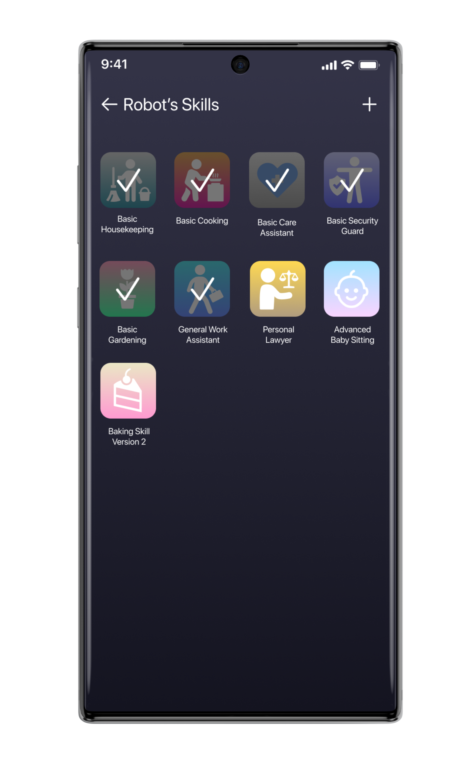
Task 3: Install a new skill for robot
Task 4: Change the app theme
Error-free rate
All participants were able to complete every task without needing any assistant except Task 3 (Finding a ticket wallet). All participants showed a slight delay and confusion at finding a way to a ticket wallet that is hidden in the Saved Page.
Participant 1: 90% Success (showed a delay and needed an assistant to find a skill setting screen)
Participant 2: 100% Success
Participant 3: 100% Success

Affinity Map
To spot out the real issues within the design, I created this affinity map that works as a collection of information from the usability result note. It helps me to prioritize what I should improve in the design and how to understand if the participant’s reactions were valid for the design improvement or not.

Priority Revision
After gathering the test results and considering further improvements, there are things that I have to work on for the next step:
Adding short-cut to Skill Setting Screen
Adding Device-syncing setting function
Spelling Error Check
Considering at adding more themes that has a good accessibility for users with poor eye sight.


Summary
This project is my UX case study project that I have came up with and planned by myself. During the project, I got my mentor as an advisor throughout the whole process.
The original idea for this project has come from my fascination with artificial intelligence and robots. I wanted to try to design a mobile app for a personal robot that has not existed yet. I started it without a doubt as a way to challenge myself to learn further beyond what I understood about UX design.
The big question that I had for the whole time was, “How do I find inspirations of today’s era that would inspire me to design the product of the future?”
This project is one of my most favorite projects that I have ever done as it allows me to use a lot of creativity and observation of all experiences in our everyday lives. I got to learn more about A.I. and to find inspiration from sci-fi films and my gaming experiences.
This project has revealed plenty of secrets of how people do feel about this new technology. As I have spoken to more people, I realized that we already have robots working for us, and A.I. is everywhere from the search algorithm, the text messenger, forecast, GPS navigation, etc.
The greatest lesson that this project taught me was that it is absolutely possible to design a very simple user-friendly product of something that doesn’t yet exist. User experience is like picking an existing design pattern and apply it to the right purpose. After testing the prototype, it was a great success that I had received a lot of positive reactions and a high error-free product testing rate.
I also showed the prototype to another more of 10-12 people as the non-official usability testing; many users have expressed excitement and joy about the app, which made me very happy to that they had fun and said “Now I want to have a robot too!”.


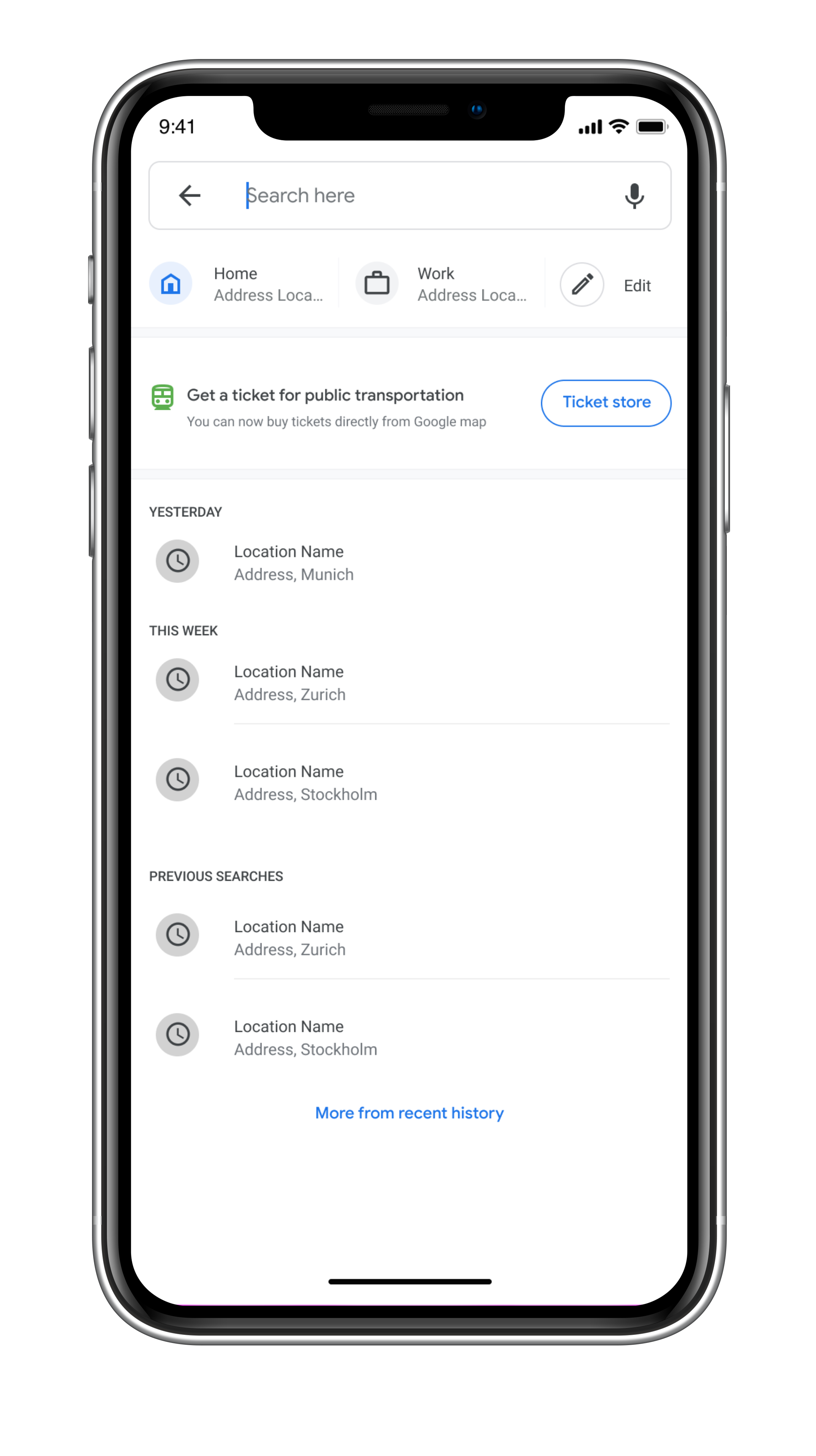
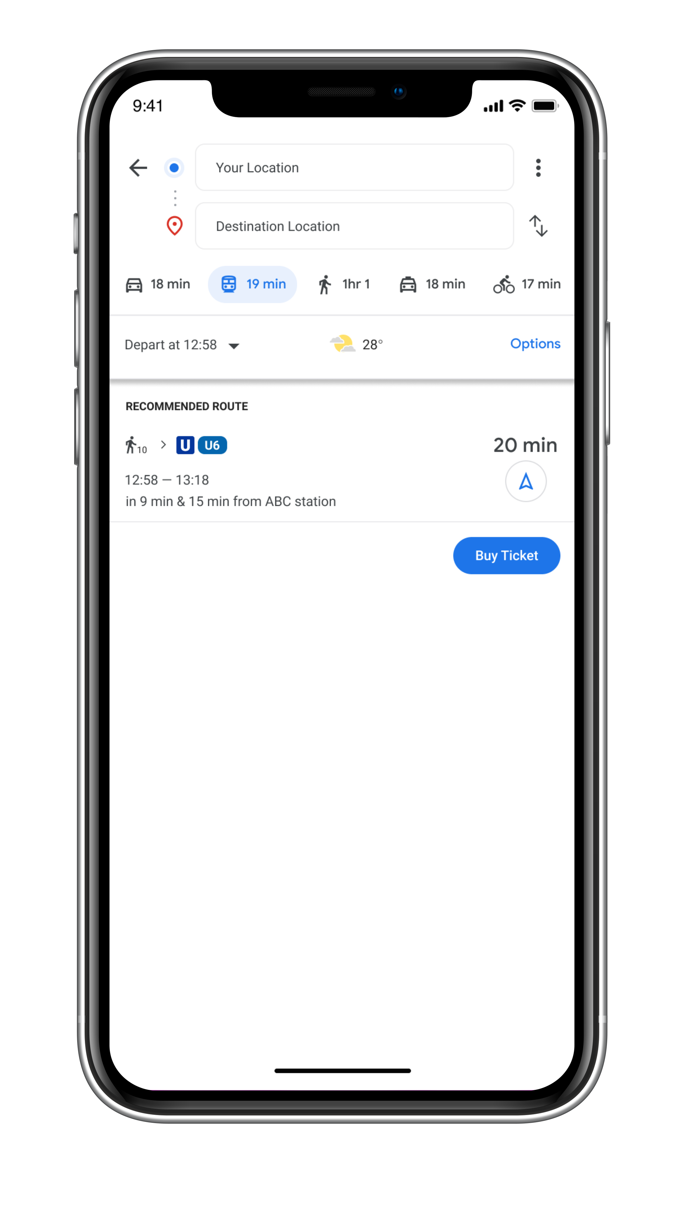
Google Map
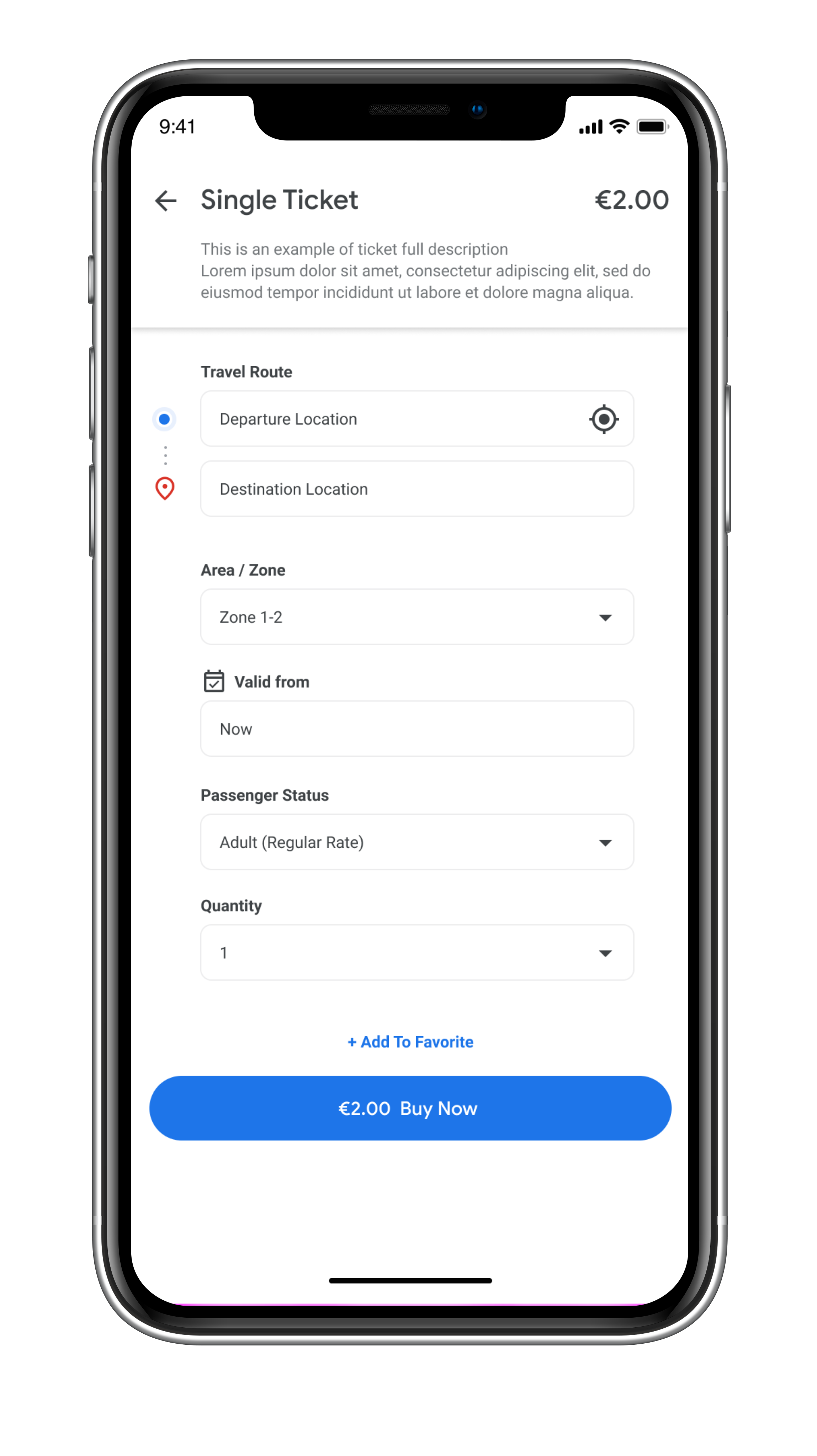
Public Transportation Ticket Feature | Allows users to buy public transportation tickets directly within the Google Map app

Allows users to buy public transportation tickets directly within the Google Map app
Challenge
WHAT DOES THE COMPANY WANT?
I am working on google Germany’s quarter, and the company came up with a project to design a new feature for the users to able to purchase tickets for public transportation around the world. For now, the company wants me to design this feature to be suitable for European public transportation. (Fictional case scenario)
REASONS TO DESIGN
Google noticed that many users are relying on the Google map when they are traveling using public transportation in Germany. However, different cities in Germany have separate apps for online ticket purchases, and it is an opportunity for Google to make online tickets easily accessible for everybody traveling and locating in Germany. This will also encourage people to use more public transportation, which is a more sustainable way to travel around the city area.
Background
Google Maps is a web mapping service developed by Google. It offers satellite imagery, aerial photography, street maps, 360° interactive panoramic views of streets (Street View), real-time traffic conditions, and route planning for traveling by foot, car, bicycle and air (in beta), or public transportation. In 2020, Google Maps was used by over 1 billion people every month.
Google Maps first started as a C++ program designed by two Danish brothers, Lars and Jens Eilstrup Rasmussen, at the Sydney-based company Where 2 Technologies. In October 2004, the company was acquired by Google Inc. Then The Google ma wasp first launched on the Google Blog on February 8, 2005.
Google Maps is available as a mobile app for the Android and iOS mobile operating systems. The Android app was first released in September 2008.
Goals & Objectives
Design a new feature within google map app (For mobile)
Research on Competitor’s products
Research and study on local public transportation apps (How the ticket system works)
Test the feature with target users
Research if it is possible to add the feature into a smart watch
PROJECT DURATION
4 weeks
ROLE
UX&UI Designer, Researcher and Interaction Designer
TEAM
Chira Chirakijja (Me)
Paddy Donnelly (Support & Mentor)
STAKEHOLDER
Google Inc. (Only for a case study - Fictional Client)

Research Goals
How does the online ticket store work?
Who are the competitors?
What competitors do well and poorly in offering an online ticket store for public transport?
How does the public transport ticket system work in Germany / the EU?
How to design a feature for a smartwatch?
How do people use a smartwatch while traveling in the city?
Data Collection (Secondary Research)
To define the target user group for the Google Map's ticket feature, I began with secondary research by collecting data from the internet and from an observation of the people who would be most likely to buy public tickets via a mobile app.
Who are the users for the public transportation ticket feature?
From my observation and research, the potential group of users is:
1. Local Residents
2. Professional Expats
3. Tourists
The research has helped me to create the set of questions that reveal the motivations and wants of 3 different groups of why would the users want to use the Google Map's ticket feature instead of the existing method.
However, this data collection doesn't answer everything I needed to understand, so the data I have obtained was the part that helped me to plan out how I would conduct interviews with the target users.
Research on How to design a Smart Watch feature
Because I was interested in designing a feature for the smartwatch as well as the mobile version. I have collected some research data that would help me to understand how to design a feature for a smartwatch.
However, I have not prioritized to complete the smartwatch feature design due to the time limitation and my lack of experience in using a smartwatch.

Competitor Analysis
In order to understand how the public transportation ticket apps work, I have conducted a research on the competitor’s products. Even though, Google Map has become a popular app for users around the world, Not every cities/countries in Europe have the E-ticket system available. So, I have chosen specific major cities such as Munich, Berlin, Zurich, Vienna and Stockholm for the analysis.
Design Audit was a main method that helped me to learn the pros and cons of the ticket apps available in the 5 chosen cities.
The followings are the applications that I have analysed:
Munich, Germany (MVV App)
Munich, Germany (MVG App)
Berlin, Germany (BVG App)
Zurich, Switzerland (ZVV App)
Vienna, Austria (WienMobil App)
Stockholm, Sweden (SL App)
User Interviews
To understand what my target users feel about their experiences in buying tickets from both mobile apps and a physical machine, I have conducted a 1-1 interview with 3 participants who have met the requirement of the target user of this project. All of the participants were aged between 20-28 years old and had absolutely different backgrounds. All of them have different opinions about digital tickets and physical tickets. They also gave me a lot of insight about their frustrations and impressions about their local systems and reasons why they dislike or like a particular way of buying tickets.
ABOUT PARTICIPANTS

3 Participants
2 Female, 1 Male
Age 20 - 28 years old (Millennials)
All of them are Google Map users
All of them have experiences in using mobile apps for buying public transportation tickets
1 Participant has given up mobile app due to bad experience
1 Participant is natural about both physical ticket and digital ticket
1 Participant prefers digital ticket over physical ticket
Persona Creation
To define and empathize better with the target users, I utilized all of the research finding and interviews to create 2 personas. These personas represents the potential users for the new ticket feature.


Storyboard
A storyboard is a great tool to better empathize with the target user. We can see through the user’s possible experience and motivation that would lead him or her to use the product. The storyboard was made based on secondary research, observation, user-interviews, and persona creation. Not only as a great tool to empathize, but it is also a helpful way to communicate and present the benefits of the product to the stakeholder and a team.
Information Architecture
Product Roadmap
To start designing the new Google Map’s ticket feature, the product roadmap contains the lists of different priorities of the features that will be added to the product. I utilized the competitor’s research to helped me to create the list of the features.

Site Map
To design how the new feature navigates, this sitemap works in a manner that helps me to see how it would be possible to design the new ticket feature within the existing App. The Challenge is that the ticket feature would appear as the specialized function that should find its place among the existing main functions without disrupting what is already there.
User Flow
In order to learn how the sitemap would work, I created 3 usage case scenarios. Each scenario gave me a better picture of how a user would go through step by step. Not everything from the product roadmap and sitemap was able to fit into the design, so the user flow helped me to prioritize what necessary for the feature.
Low-Fidelity Wireframe Sketches
To create the design structure, I utilized the research findings, priority product roadmap, site map and user flow to help with the sketches. Competitor’s design audit has played a significant role in inspiring and showing me the useful design patterns that I could apply to the design. The advantages of low-fidelity wireframe are high flexibility to make adjustment, time-saving and sometime it gives organic sources of inspiration.
Interaction Design
Mid-Fidelity Wireframe
After finishing with the low-fidelity wireframes, I transformed the low-fidelity wireframe into the digital form. Mid-Fidelity Wireframes help me to determine the layout sizes, construct the product architecture, making design adjustments, and works as an outline for the next stage fidelity. Mid-Fidelity is a stage that lets me decide if the structure would be realistically suitable for the existing app.
I also made changes multiple times in the mid-fidelity wireframe to make sure that the new feature would not interrupt the existing functions.
UI Design
UI Kit
To create the high-fidelity design of the ticket feature, Google map already has a strict rule of the UI and style that a design must follow. Fortunately, Google is very transparent about their design materials and I was able to follow the exact design rule that Google Map has. I have created this simple UI Kit to help me to complete the high-fidelity design efficiently.

Material.io is the primary source that is run by Google inc. This website is where I found everything from fonts, design principles, and icons that have been used for designing Google Map app and also all Google’s products.

Iteration & Implementation
High-Fidelity Prototype
This High Fidelity Prototype is the version that I’ve used for the usability testing.

Usability Test
To measure the usability of the product design, it is essential to conduct the testing with the target users. It helps revealing weak and strong spots of the design which is great for a designer to know how he or she can improve the design. I used the first version of the high-fidelity prototype to test out with 3 testing participants who were previously interviewed on the early stage of this project.

TEST OBJECTIVE
To spot the features or elements that create fruition or confusions to the users
To observe how well users navigate within the platform and the app
To watch how much time users spend to finish the task
To find error and to improve the design to make it as user-friendly as possible
PARTICIPANTS
3 Participants
2 Female, 1 Male
Age 20 - 28 years old (Millennials)
All of them are Google Map users
All of them have experiences in using mobile apps for buying public transportation tickets
TASKS
Task 1: Find a direction to a destination (Google Building in Munich)
Task 2: Buy a single ticket for Munich public transportation
Task 3: Find a ticket wallet and find a valid day ticket for Munich
Task 4: Restart the prototype and buy a day ticket again without searching for a destination
COMPLETION RATE
Goal: All participants has completed all tasks
Participant 1: 100% Success
Participant 2: 100% Success
Participant 3: 100% Success
ERROR-FREE RATE
All participants were able to complete every task without needing any assistant except Task 3 (Finding a ticket wallet). All participants showed a slight delay and confusion at finding a way to a ticket wallet that is hidden in the Saved Page.
Participant 1: 90% Success (showed a delay and needed an assistant to find the ticket wallet)
Participant 2: 100% Success (was slightly delayed at finding a ticket wallet but didn’t need any assistant).
Participant 3: 90% Success (was confused and needed an assistant to find the ticket wallet)
TEST CONCLUSION
All participants showed high confidence in searching for a destination and high confidence in buying tickets. All of them said that the ticket feature is very simple to use, especially the buying process. However, all of them showed the sign of confusion and delay at finding the way to a ticket wallet feature by starting at the Explore page.
I assumed that with the limited navigation options that already existed within the Google Map. All of them didn’t understand the Saved Page and didn’t expect the ticket wallet to be there. I assumed that it is crucial to have a short cut that would allow users to be able to find the ticket wallet without having to remember where to find it. All the users were able to quickly find the ticket wallet via the ticket confirmation page by clicking the “Go to my ticket wallet” Button.
Affinity Map
To spot out the real issues within the design, I created this affinity map that works as a collection of information from the usability result note. It helps me to prioritize what I should improve in the design and how to understand if the participant’s reactions were valid for the design improvement or not.
Priority Revision
After gathering the test results and considering further improvements, there are things that I have to work on for the next step:
Improve the Checkout by adding Sign-in Option
Add more payment methods
Considering the a short-cut for users to access the ticket wallet


Summary
This Google Map’s Ticket feature project is my third UX study case that I planned and organized by myself, with some consults from my mentor. This project was inspired by my own experience as a person who lives in an urban area and been using a public transportation. Usually, I use a mobile app that is available in Munich to buy a public transportation ticket. However, every cities has their own application and it is impossible for me to always buy a ticket from a mobile phone when I travel to different cities.
The issue that I have faced when buying a public transportation ticket in different cities is that it can be annoying to always need to re-learn the unfamiliar system in different places. When it comes to Google map, the app works as the most trusted universal mobile app when people travel to different cities, so this gave me a question “I use Google Map all the time, why can’t I just buy every ticket from here too?”.
Since most people and including me are using google map every time when we want to use a public transportation, I came up with an idea to design a feature in Google Map that would allow users to buy public transportation tickets for everywhere they go!
Along the design process, I have learned more about Google's design principle and also the flaws in its product like Google Map. The challenge that faced during the process is to design a specialized feature to an app that already has a lot of functions. To avoid cluttering the interface while making sure that the feature has good usability is something that I focused the most. I had to accept the fact that the feature will not be as perfect as I expected. There was some minor usability issue that I could not solve entirely. But instead, it allowed me to find an indirect solution for a particular issue without making any changes to the existing design.


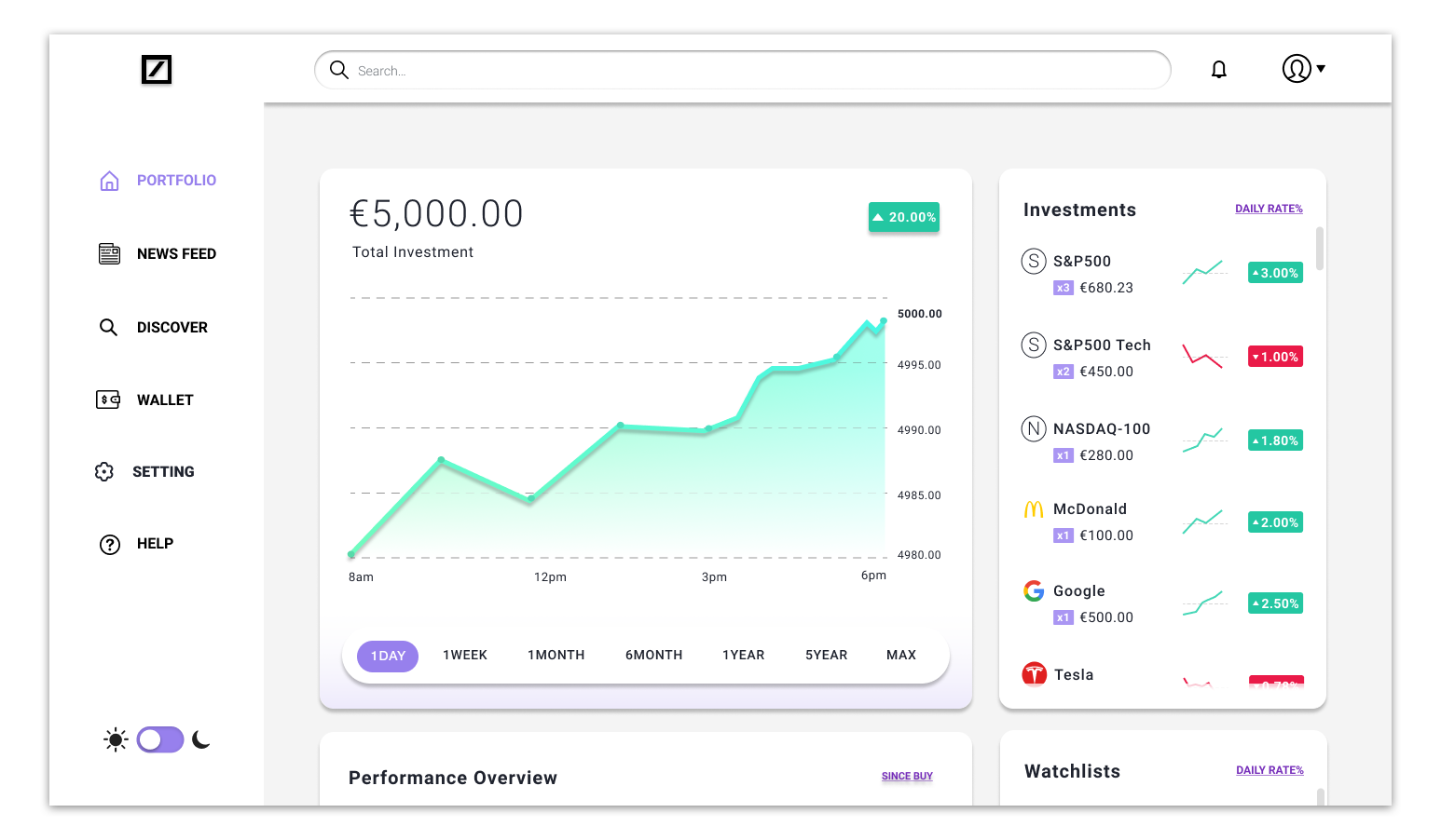
Deutsche Bank
Stock Trading Platform & App | Deutsche Bank’s user-friendly stock trading platform & mobile app
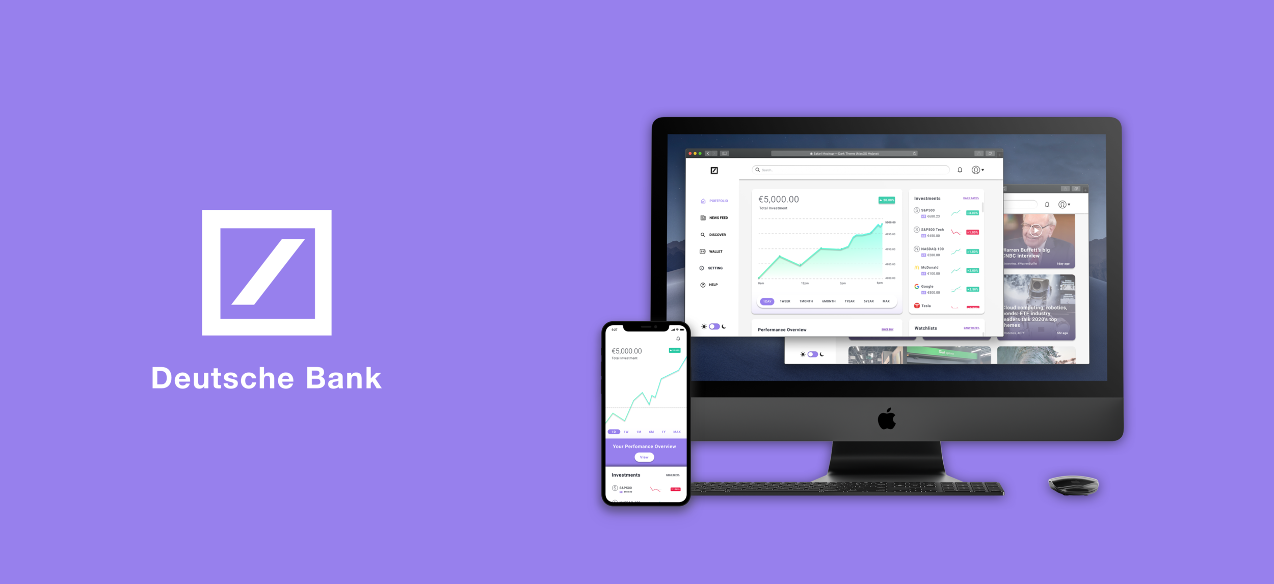
Deutsche Bank’s user-friendly stock trading platform & mobile app
Background
Deutsche Bank AG is a global multi-international investment bank, cooperate bank and a private bank that provides services and operates in 60 countries around the world, with its leading power in Germany and Europe. (According to Deutsche Bank’s Homepage) Founded since 1870 in Germany by Ludwig Bamberge.
“I am fearful for Deutsche’s future prospects as we have entered an era where commission from trading has all but vanished and the margins to be made in market making are wafer thin.” - Forbes’s Finance News reporter 20202 (Fact)
Since the company’s financial situation doesn’t appear positive, Deutsche Bank hopes to gain back its current trading users and also new customers. With the hope that they could provide a better digital product that would help the company to gain back revenue. (Fictional)
Challenge
WHAT DOES THE COMPANY WANT?
The reason that Deutsche Bank wants a new stock trading platform & mobile app, is that the boards started to be concerned by the decrease numbers of current and new users of their existing online trading platform. (Fictional)
“There has been an issue of having stuck with outdated technology instead of investing in the latest equipment that could have boosted efficiency and a drain of top talent.” - Forbes 2020 on Deutsche Bank. (Fact)
Deutsche Bank has noticed that despite the decrease in its users for the trading platform, the online trading market doesn’t get any smaller, but instead, it has become even more competitive than ever. There are more and more trading applications been created in the market nowadays.
Project Duration
5 weeks
Role
UX&UI Designer, Researcher and Interaction Designer
Team
Chira Chirakijja (Me)
Andrew Graunke (Support & Mentor for Early Stage)
Paddy Donnelly (Support & Mentor for Mid & Later Stage)
Stakeholder
Deutsche Bank (Only for a case study - Fictional Client)
Goals & Objectives
Design a user-friendly Desktop Platform
Design a user-friendly Mobile application
Rebranding for the new trading app & platform
Design Audit the current Deutsche Bank’s trading platform
Research on Competitors and Design Auditing
Research on what today’s online trading platform needs? (Features and functions)
Test the product design and make sure the product is simple to use but functional at the same time.

Research Goals
Who are the most potential target users for a stock trading app?
Who are the competitors for DB’s Trading App?
What competitors do well and poorly in offering an online trading service and experience?
What users like or dislikes in trading apps?
What influences users to stay in the service?
What makes an excellent online trading platform?
What could be the challenges in designing the trading platform and app?
Design Review (Deutsche Bank’s Current Product)
Maxblue runs a responsive online trading web-platform that is only available for people residing in Germany. Maxblue doesn't have a separate mobile application or any separated software. Since it is not simple to open a portfolio with Maxblue or unless the users already have an active accounts with Deutsche Bank. New users can access to "Demo Account" to check out Maxblue's platform.

MAXBLUE’S PROBLEMS
Outdated product design and lack of brand development: To find out more reviews from Maxblue users, I have found discussion forums of people who live in Germany. (toytowngermany.com). People were talking about how Maxblue used to be one of the best and most affordable online trading option for them in the early 2010s. However, in 2020, I have asked millennial investors and traders who are based in Germany; nobody knows about “Maxblue.”
False Advertisement about the product: There are misleading advertisements and articles about how Maxblue offers “Application.” But the reality is Maxblue only offers web-platform. Deutsche Bank and Maxblue staffs that I have spoken to confirm the non-existence of the Maxblue Application
SOLUTIONS
Rebranding: Deutsche Bank needs to rebrand its online trading product to be suitable for the current era. Despite the higher competition in the online trading field, the name of the brand (Maxblue) should be changed to something more related to its parent brand, like Deutsche Bank.
Design a new application for Desktop and Mobile: To gain back user traffic to the online trading product, Deutsche should have a unique design of the product in the form of “application” for both desktop and mobile devices.
Design for a better experience: The product design should be re-designed to be more comfortable and more convenient to use. The product should have the right amount of learnability that allows users to learn and solve the issue by themselves quickly.
Design for the modern era: The reason why Deutsche should have a new UI Design for the online trading product is that today’s information overload era requires products to have some level of minimalism to help users to focus on their tasks better. It is essential to reduce distraction and clutter in the visuality of the product.
Add user-guideline: To sustain the numbers of both current and new users. The product should have a clear user-guideline or instruction to help users to learn and understand how to use the product better.
Market Research
To understand the demographics of online investment users, I have collected some information from online sources that mention who are the potential users for this kind of product. Many sources have claimed that the Millennial user group is the big generation that tends to use online investment platforms. In contrast, the other older generation makes a different approach to investing styles.
How Millennials invest?
According to Business Insider article in 2017 claims that, “Data collected over several years of activity on the app shows that its average 30-year-old millennial users tend to buy more shares than they sell, and they are more likely to buy a few shares of dozens of different stocks for a diversified portfolio.” (Source)
Investment Confidence
Growthbusiness.co.uk has mentioned, the report used to suggested that Millennials and Gen Zers tended to have no money and poor financial future. But the new study of 2017, suggested that Millenials and GenZ now have more confident about investing than any older generations “The 2,000 people surveyed, 35% of millennials are investing or saving more than £250 per month compared to 26% of Gen X and 25% of Baby Boomers.” (Source)
Online investing platform opportunity
According to Raconteur (Source)
“Millennials see technology as integral to the process, with 67 per cent expecting computer- generated recommendations as a basic component.” - Neil Gourlay, managing director of financial services at Accenture UK
“At the same time, 66% of millennials want a self-directed investment portal with adviser access, compared with just 25 per cent of Generation Xers and baby boomers. These are digital natives, who want autonomy over their own financial decisions and see anything other than a simple, straightforward customer experience as friction” - Neil Gourlay, managing director of financial services at Accenture UK
“Digital investment platforms are lowering the bar of entry for investing, opening up more opportunities for young people. The big institutions are failing to connect with younger investors because they haven’t realised that finance isn’t always transactional for this new audience.,” - Kerim Derhalli, founder and chief executive of Invstr

Competitor Analysis
In order to figure the potential competitors of Deutsche Bank's trading app. Most trading applications are available on only specific continents to depend on where the users are. Here, I will focus on companies that offer services to only Europe based users and Global ones.
The reason I picked these companies (below) for the analysis is that these are the most well known online trading platform that are offering services to users who are based in Europe and the UK. These competitors are the high ranked companies that have designed a user-friendly platform for both desktop and mobile. And it is an opportunity to learn why these products have become popular in 2020, according to brokerchooser.com.
In the other hand, Robinhood which has been considered one of the best-designed stock trading app. Robinhood is only an indirect competitor in the business sense, which means Robinhood's product can be an excellent example of the best user-friendly stock trading app that suits the modern generation.

User Interviews
To understand what my target users feel about their experiences in using different stock trading platform or application. Over the course three days, I have interviewed 3 participants who have different kinds of backgrounds, but all of them are age between 23-29 years old. They gave me plenty of insights about their own experiences with online trading platforms and apps that they use or have used.

ABOUT PARTICIPANTS
3 Participants
2 Males, 1 Female
Age 23 - 29 years old (Millennials)
All have experience in using online trading platforms and apps
2 Participants are currently investing with trading platforms and apps
1 Participant is interested in starting online investment
Persona Creation
To define and empathize better with the target users, I utilized all of the research finding and interviews to create 2 personas. These personas represents the potential users for the new trading platform & app.


Information Architecture
Product Roadmap
To start designing a stock trading platform & app, the product roadmap contains the lists of different priorities of the features that will be added to the product. The crucial thing about designing a modern stock trading platform and application is that a designer must not underdo or overdo with adding features into their design. This process helps me defines what would make a user-friendly design.

Site Map
To design the product's navigation, a sitemap helps me to organize the information architecture of the user interface. This sitemap works in a manner that helps designers to design the product that is easy to navigate. The mistake that I have seen from Maxblue's platform (Current Deutsche Bank’s Trading Platform) is that it has too many navigation menus and links, poor information organization would result in confusion and distraction for the users while they are using the product.
So, that is why this sitemap has the purpose of simplifying the navigation hierarchy while also preserves functionality and design consistency between different devices.

Low-Fidelity Wireframe Sketches
To create the design structure, I utilized the research findings, priority product roadmap, and site map to help with the sketches. Competitor’s design audit has played a significant role in inspiring and showing me the useful design patterns that I could apply to the product design. The advantages of low-fidelity wireframe are high flexibility to make adjustment, time-saving and sometime it gives organic sources of inspiration.
To keep the design consistency in different devices, I mastered the desktop design before moving forward to the mobile design.
Interaction Design
Mid-Fidelity Desktop Wireframe
After finishing with the low-fidelity wireframes, I transformed the low-fidelity wireframe into the digital form. Mid-Fidelity Wireframes help me to determine the layout sizes, construct the product architecture, making design adjustments, and works as an outline for the next stage fidelity.
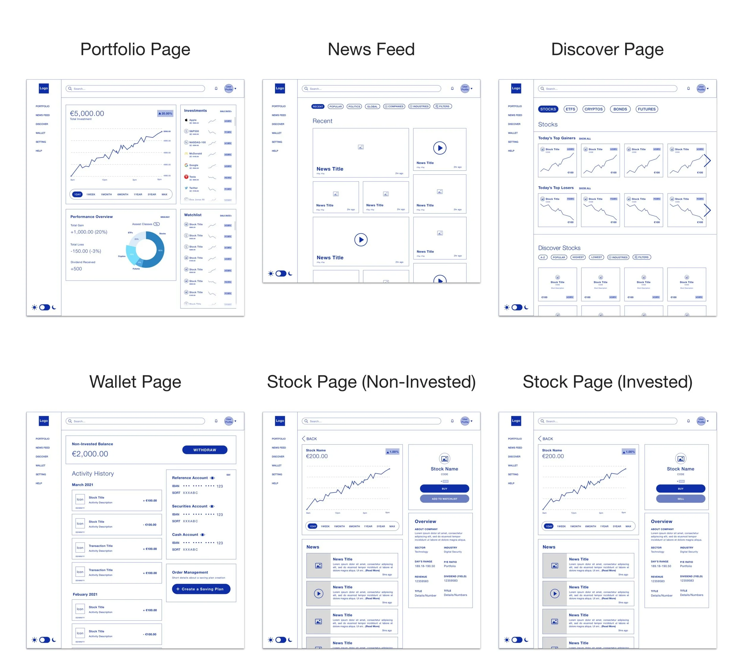
Mid-Fidelity Mobile Wireframe

UI Design
Mood Board
Even, Deutsche Bank is an existing brand that already has strict branding guidelines that designers must religiously follow in real case scenarios. For this case study, I would like to propose re-branding for the new stock trading product, which is a separate product that is designed for the younger generation investors like Millennials and GenZers. I created a mood board as a source of inspiration for the product's UI. I have approached the modern and futuristic style that still has a fun touch into it.

Style Guide
To complete the style guideline for this project, I used inspirations that I discovered within the mood board. According to my interview with a participant who is very new in investing, she reminded me that the branding and UI design influences confidence in starting an investment. The power of style visual is not something to be neglected.
Why don’t I follow Deutsche Bank’s brand guideline?
Even though I understand that in real life, Deutsche Bank wouldn’t allow their designers to make any change to their style guidelines, I was considering Deutsche Bank’s traditional shade of blue to appears too serious and somewhat not so modern (Not suitable this new product). I don’t want the visual design of the product to intimidate new users, but at the same time, I want the style also to appear professional and high tech.
Instead of blue, I choose violet as a brand color because it is not too far from blue, and it represents futurism, modern era, prosperity, and just more fun! What I have learned from grate modern digital products is that the design should have a slight touch of fun and friendliness to give courage and a little more joy to the users.
UI Kit
To help to make the high-fidelity design process efficient, I set out the UI Kit with elements that I believe they will be applied in design often. It saved more time in the process and also create design consistency. In real life, UI Kit is not a useful tool for a solo project but also for designers to work together on the same project.
Iteration & Implementation
High-Fidelity Prototypes
* Prototype work spaces*
Usability Test
To measure the usability of the product design, it is essential to conduct the testing with the target users. It helps revealing weak and strong spots of the design which is great for a designer to know how he or she can improve the design. I used my high-fidelity prototypes for both desktop platform and mobile application for the test on each participants. I allowed them be able to freely explore the prototype, while I offering 2 main tasks.
Participants
3 Participants
All Male
Age between 28-35 years old
Test Method: In-Person and Remote Test
2 Participants are currently investing in stocks
1 Participant is interested in stock trading / investing
Test Objective
To spot the features or elements that create fruition or confusions to the users
To observe how well users navigate within the platform and the app
To watch how much time users spend to finish the task
To find error and to improve the design to make it as user-friendly as possible
Tasks
Task 1: Understand the use of every navigation menu
(I asked them to explain the menu definition by their understanding)
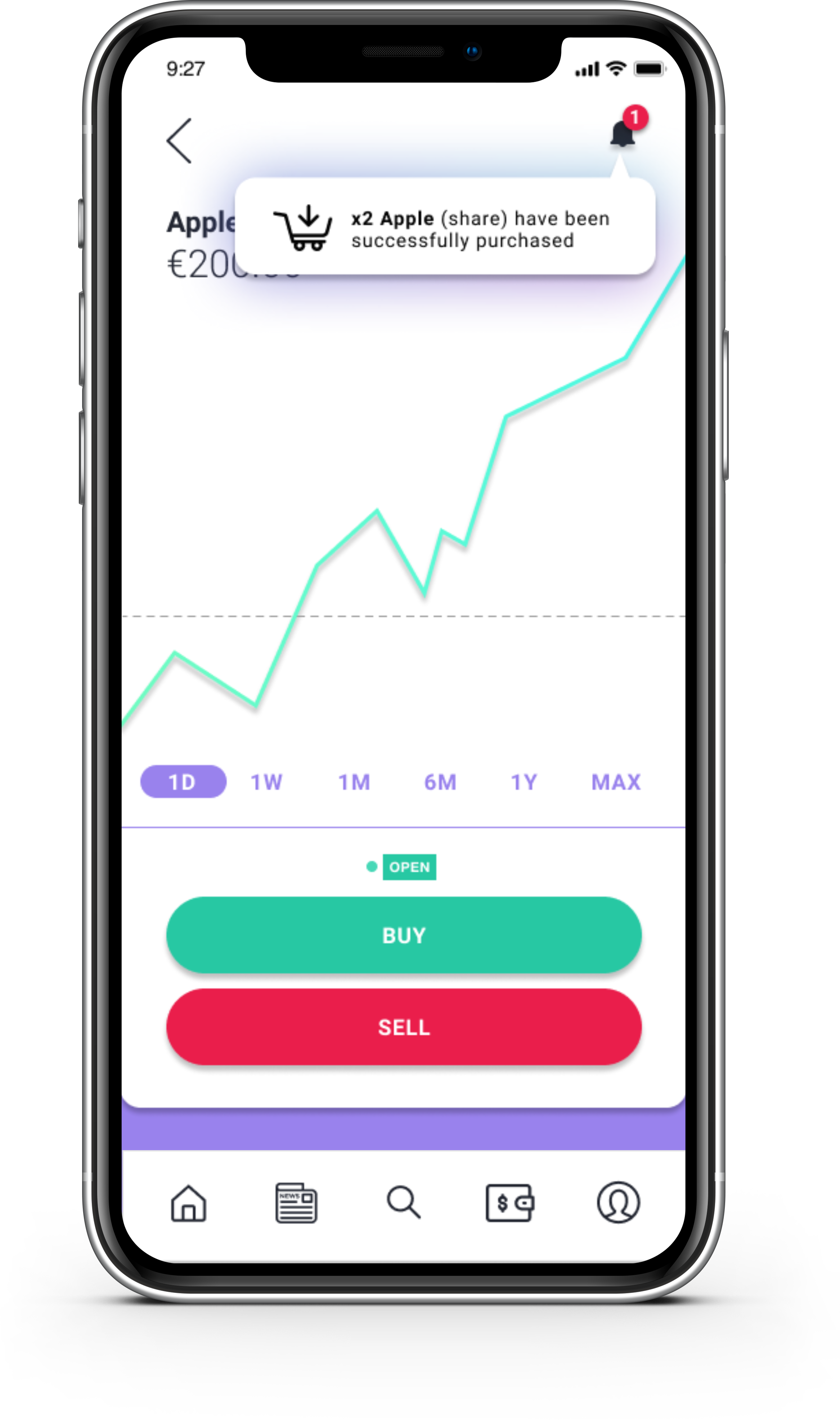
Task 2: Buy APPLE stock share
Error-free rate
All Participants didn’t need any assistance or showed any confusions & frustration.
Participant 1: 100% Success
Participant 2: 100% Success
Participant 3: 100% Success
Completion Rate
Goal: All participants has completed all tasks
Participant 1: 100% Success
Participant 2: 100% Success
Participant 3: 100% Success

Test Conclusion
All the participants had high confidence in testing out both the desktop platform and mobile app. Even those 3 participants have different level experiences in the online stock trading, but they were able to accomplish all the tasks without any concerns and not need any assistance. All of them agreed that the design was very easy and enjoyable to use. But 3 of them have given some thoughts and comments on improving the small parts of the UI Design, such as making News Block sizes equal, Market Closing/Opening time feature, an improvement on Placeholder text and labels.
Affinity Map
To spot out the real issues within the design, I created this affinity map that works as a collection of information from the usability result note. It helps me to prioritize what I should improve in the design and how to understand if the participant’s reactions were valid for the design improvement or not.
Priority Revision
After gathering the test results and considering further improvements, there are things that I have to work on for the next step:
Create the Dark Theme UI Design and Test it
Make the block sizes equal and more symmetrical
Icon Testing: To find out if the target users understand the icons as same as its context
Design the graph’s functionality
Design the filter’s functionality
Create News Content Page


Summary
This Deutsche Bank project is my second UX case study that I planned and organized by myself. I am fortunate to have two mentors who have different perspectives to help me along during this project. The inspiration for starting this project was from my own frustration as a stock trading app user who is a beginner in investing.
I found most available stock trading platforms and apps for people located in Germany and the EU, tend to be non-userfriendly and complicated for beginners like me. While I wish that I could use something like the Robinhood app, which is incredibly user-friendly and very modern. (But only available for the US).
I picked Deutsche Bank as my fictional client because Deutsche Bank is a well-branded bank that doesn't have a user-friendly product for stock trading. And my thought was, "Why such a big company like Deutsche Bank doesn’t have anything like the American startup!?"
It has been a very new learning experience for me to design an information-based product like a trading platform & app. There were challenges in figuring how to create a product that would make stock trading feels easy for both beginners and experienced investors. I found myself learning more about investing and even understanding why most people and I were holding back ourselves from starting to invest in stocks. Sometimes, it is the designers who to be blamed or praised to.
In final, I very much enjoyed the challenge of this project that kept me excited and curious every day. I hope I'd have an opportunity to work on the real trading platform and application again in the future.


MIRROR
Fashion E-Commerce | Responsive user-friendly fashion e-commerce for desktop, tablet and mobile

User-friendly responsive fashion e-commerce
MIRROR is a clothing brand, selling low priced and good quality clothing for both men and women. MIRROR has over 400 stores worldwide, 32 countries. The brand has competitors as Old Navy and H&M who are in the same fast fashion industry. However, MIRROR wants to digitalize and rebrand itself to be suitable to the current digital age.
Project duration:
10 weeks
ROLE:
UX&UI Designer, Researcher and Interaction Designer
team:
Chira Chirakijja (Me)
Mryto Papagiannakou (Support & Mentor)
Stakeholder:
MIRROR (Fictional Company created by Designlab)
Challenge
Since MIRROR has been a successful offline fashion business for a long time, the brand started to experience a decrease in customer traffic.
Goals & Objectives
Rebranding, Updating a new logo, new color schemes, and style to attract more customers and to be stand out from its competitions.
Designing a responsive website that enhances customer’s online shopping experience
Project Process

Research Goals
To obtain research answers for these questions…
What do competitors do well and poorly in offering online shopping experiences to their customers?
How do people shop online?
What makes customers wanting to shop online?
What makes an excellent online shopping experience?
What could be the challenges in offering online shopping?
Competitor Analysis

User Interviews
To understand and gain insights into user’s experiences with fashion e-commerce websites, I have conducted 1-on-1 interviews with 3 millennials who are based in Munich, Germany. All of them have different lifestyles, backgrounds, and different motivations when it comes to purchasing new clothing. All of the users admitted that they prefer to fashion online shopping over in-store. In the course of 2 days, the interviews helped me to discover more facts about why the users would prefer to shop at any specific website and to find out what concerns or frustrates them when it comes to online shopping.
PARTICIPANTS:
3 Participants
1 Female and 2 Males
Age between 25-28 years old
All based in Munich, Germany

Persona Creation
After gathering research about the potential users for MIRROR, I utilized the information to use as the inspiration for creating the user persona. The persona is a great tool to help a designer to empathize with the target users at another level.

Empathy Map
To be able to empathize with the user even better, an empathy map helped me to understand even more in-depth about the individual persona's feelings, motivations, and wishes. Empathy map also helped me to be able to consider on what features I should prioritize on applying to the design.

Story board: Lucas’s New Suit
A storyboard is a great tool that shows the benefits of how the product could potentially be applied to the user's possible experiences. I have utilized the inspiration from the persona creation, empathy map and an observation on the real target user (In this case, it was my friends)

Information Architecture
Product Roadmap
To make the priority for product features, I utilized the information and what I’ve learned from the research phase to come up with features that the fashion e-commerce needs to have. The product roadmap is a helpful list that helped me prioritize the importance of the features. Researching on competitor’s websites were necessary for this process.

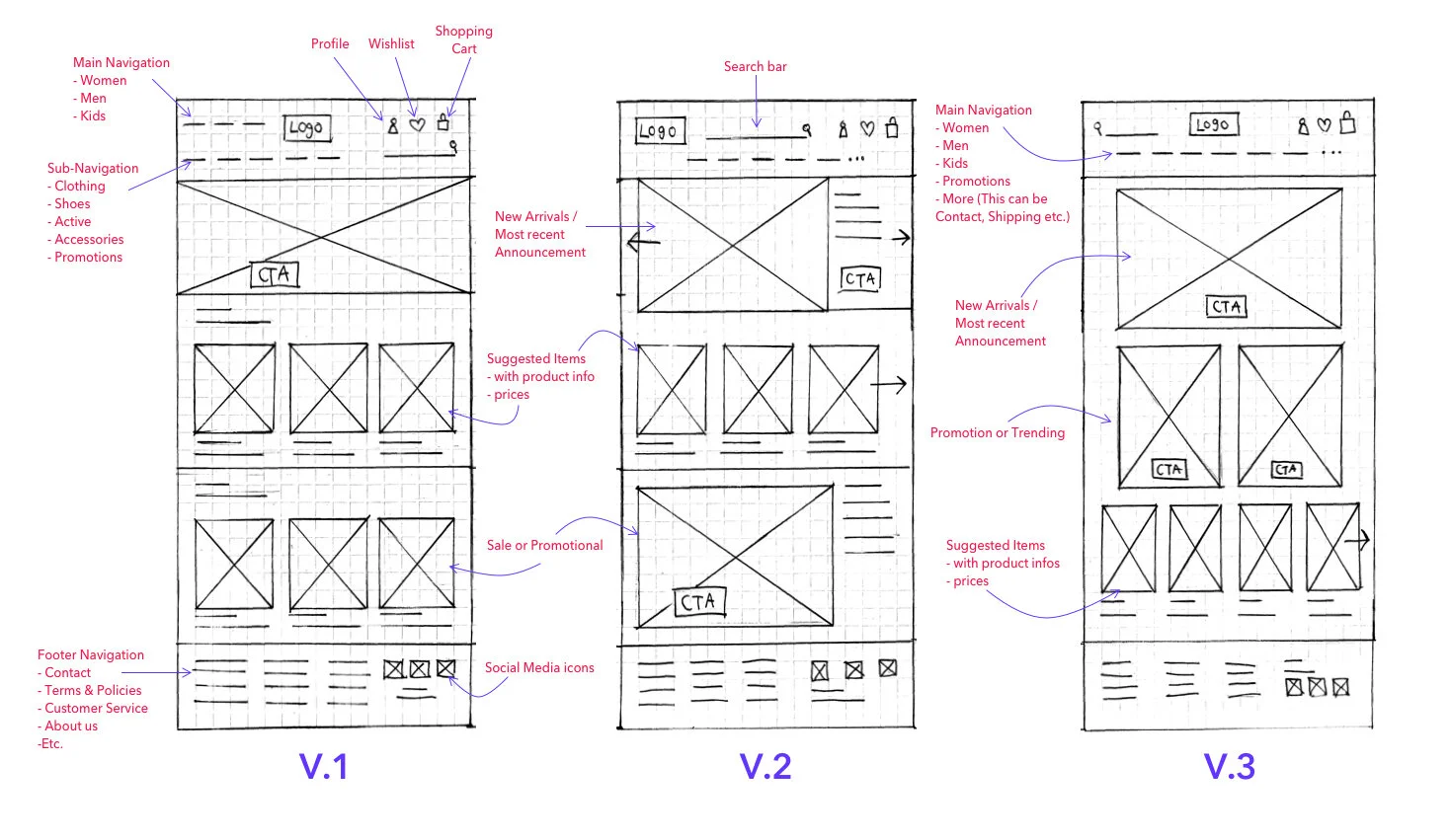
Low Fidelity Sketches
After coming up with the product feature lists, I have come up with 3 versions of the desktop design for the website. I have learned that it is essential to design the product from a larger device format to smaller ones, and coming up with more than 1 version then helped me along the process for creating mid-fidelity wireframe.
Sitemap
Before beginning to transform the low-fidelity wireframe into mid-fidelity one, I needed to have more details of the website navigation. Creating a sitemap allowed me to be able to plan out how the website should be laid out. I have tried to make the sitemap to be laid out as simple as possible because I needed to make sure that the MIRROR website would turn out as user-friendly as possible. I also have applied additional competition research to support MIRROR Sitemap creation.

View Full-Size
Interaction Design
User Flow
Plan out the Shopping Experience
To see how the website navigation would affect the user’s experiences, I created this user flow to understand the steps of how a user would navigate through fashion e-commerce and also how his shopping experiences would turn out in different case scenarios. It is an essential step in designing the product as we can make sure if the website navigation would not be confusing for users.

Mid-Fidelity Wireframe
To design a structure of the MIRROR website, I have utilized low-fidelity wireframes, product roadmap, sitemap, and user flow to help with creating the mid-fidelity wireframe. I have created wireframes of the pages that are the most prioritized based on the user-flow. I also have applied further competitor research to help with the inspiration for improving the wireframe design along the creation process.


Responsive Wireframes
As the most important goal in this project is to design the responsive website, I have completed the mid-fidelity wireframe first. As my mentor has approved the design of the desktop wireframe, I moved to one smaller device.

Mid-Fidelity Prototype
Along the way, to test out the design usability, I have transformed the mid-fidelity wireframe into a prototype. The Mid-fidelity prototype is a great way to test out the design structure. At the same time, it gives flexibility for a design to be able to come back and improve the mid-fidelity wireframe. The only downside is that Mid-fidelity prototype doesn’t feel as realistic as the high-fidelity.

Mood board
The Mood board is an important process of branding and UI design. As I have learned about the target users for the MIRROR are both female and male millennials who are based in Europe. I was able to figured out the aesthetic and fashion trend that would suit the current era. The theme that I went for is something modern, sophisticated, yet simple because I understand that the target users are young professionals. They are looking for clothes that they can wear for all occasions, including for professional events.

Logo
Design process
After I have come with a conclusion that I wanted with a simple and sophisticated theme for the brand, I decided to create a letter-based logo where I would use only serif fonts for the logo design. Along the process, I have tried out different fonts and experimenting with the logo shape by rearranging the letter positions. In the end, I decided to use a simple thin serif font for the MIRROR logo as I could imagine that this logo would be easy to recognize and also would look good on the physical product tags.
Final Logo Design
Style Tile
Behind the decisions on putting together the style tile for MIRROR is based on the underlying psychology and empathy for MIRROR target audiences. The target users of MIRROR are both Men and Women as Millennial - Gen X Professionals.
Since the MIRROR is offering low-price, but a high-quality product, the style tile of MIRROR has to present its image carefully. Users may have a higher expectation on the brand that High-Quality = Materials, External Style, and Sophisticated Brand Image - All combine.
That is why I came up with specific style as below. But over-time, the style needs to be update depends on the major fashion trend.
UI Kit
After coming up with a style guide that was surely suitable for the website UI, I put up all the design elements that I believed that would be applied on to the high-fidelity design of the website. UI Kit helped the high-fidelity design process efficient and organized as it worked as the firming design system for the designer.

Responsive UI Design
To be able to see how the UI elements that I was preparing on the UI Kit would be suitable for the design, I put the elements together over the mid-fidelity wireframe. I have made some changes later to the elements depends on the sizes, colors, and contents that I put on to this design process.
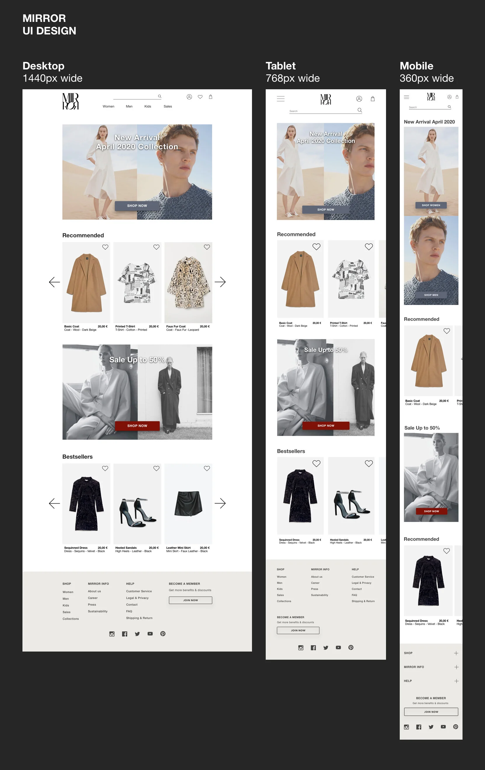
Photo Sources:
ZARA
C.O.S.
H&M
Holiday Magazine Autumn Winter 2017 Lachlan Bailey
Iteration & Implementation
High-Fidelity Prototype
After I became sure about the UI Design system for the website, I was able to create realistic prototype version.
High-fidelity prototype is a great tool to test the product to target users while they would get the most realistic feels during the testing.

Usability Test
Although, I have created two versions for the desktop prototype. I used the first version for in-person testing with 3 participants within the same day. However, one day after the testing, three participants have given me additional feedback on their experiences of using my prototype. I have learned that even though I have encouraged my participants to express their feeling and opinion during the test was not enough. Following-up questions are crucial for the design's improvement.
participant
3 Persons
Age 27-28
1 Female and 2 Males
Average Testing Time: 2-3 Minutes per person
Test Method: In-Person
Location: Zurich, Switzerland
Tasks
Add a pair of black high heels to your wish-list.
Filter and Find men's business white-collar shirts (Size L)
Go to wish-list and add high heels in size 39 and Business shirt in size L to a shopping bag and finish the checkout.
Test completion rate
Goal: All participants has completed all tasks Participant 1: 100% Success
Participant 2: 100% Success
Participant 3: 100% Success
error free rate
All participants needed some assistance, but they have quickly learned to solve the minor error by themselves. The participants didn’t experience major errors that would stop them from completing the task. Although, Participant 3, has experience a minor confusion that delay the completion.
Participant 1: 100%
Participant 2: 100%
Participant 3: 90%
This prototype is the first version (Not the Final Version)
Affinity Map
This Affinity map is the collection of information from the usability result note that I organized them into a different section. This way, it helps me to spot out the real issues within the design. It helps me to prioritize what I should improve and even to understand if the participant’s reactions were valid for the design improvement or not.

Priority Revision (Final)
About the latest adjustment
After reviewing the affinity map, I have made adjustments based on the consideration and discussion with my mentor on how I could improve the desktop design. Then, I decided to design the high-fidelity prototypes for tablet and mobile as well after the desktop prototype's adjustment. I use the design of the larger device as the base for the smaller ones for the design consistency. Yet, the smaller devices still hold their special elements that were specifically designed to suit their sizes.


Summary
Since the MIRROR is my first UX design project that I started. This project gave me a lot of learning curves for me as I learned how to design a digital product from nothing. Research was the most helpful phase that helped me to learn how user-friendly e-commerce could be designed.
The challenges during this project occurred during the research phase and the prototyping phase, where I had struggled with timing. It was a delay in learning new things while trying to accomplish work outcomes. I learned to manage time and prioritize tasks better while expecting to produce high quality effectively and efficiently.
Although most fashion e-commerce sites have very similar design patterns, and users may expect the design to be simple and familiar for them. I still wish that MIRROR could have more testing and the UI style might would have to be updated over time as it is crucial for fashion related business needs to have an up-to-date or fashion forward aesthetic.

https://undraw.co/

Sed diam nonummy euismod tincidunt ut laoreet dolore magna aliquam erat volutpat.