MIRROR

User-friendly responsive fashion e-commerce
MIRROR is a clothing brand, selling low priced and good quality clothing for both men and women. MIRROR has over 400 stores worldwide, 32 countries. The brand has competitors as Old Navy and H&M who are in the same fast fashion industry. However, MIRROR wants to digitalize and rebrand itself to be suitable to the current digital age.
Project duration:
10 weeks
ROLE:
UX&UI Designer, Researcher and Interaction Designer
team:
Chira Chirakijja (Me)
Mryto Papagiannakou (Support & Mentor)
Stakeholder:
MIRROR (Fictional Company created by Designlab)
Challenge
Since MIRROR has been a successful offline fashion business for a long time, the brand started to experience a decrease in customer traffic.
Goals & Objectives
Rebranding, Updating a new logo, new color schemes, and style to attract more customers and to be stand out from its competitions.
Designing a responsive website that enhances customer’s online shopping experience
Project Process

Research Goals
To obtain research answers for these questions…
What do competitors do well and poorly in offering online shopping experiences to their customers?
How do people shop online?
What makes customers wanting to shop online?
What makes an excellent online shopping experience?
What could be the challenges in offering online shopping?
Competitor Analysis

User Interviews
To understand and gain insights into user’s experiences with fashion e-commerce websites, I have conducted 1-on-1 interviews with 3 millennials who are based in Munich, Germany. All of them have different lifestyles, backgrounds, and different motivations when it comes to purchasing new clothing. All of the users admitted that they prefer to fashion online shopping over in-store. In the course of 2 days, the interviews helped me to discover more facts about why the users would prefer to shop at any specific website and to find out what concerns or frustrates them when it comes to online shopping.
PARTICIPANTS:
3 Participants
1 Female and 2 Males
Age between 25-28 years old
All based in Munich, Germany

Persona Creation
After gathering research about the potential users for MIRROR, I utilized the information to use as the inspiration for creating the user persona. The persona is a great tool to help a designer to empathize with the target users at another level.

Empathy Map
To be able to empathize with the user even better, an empathy map helped me to understand even more in-depth about the individual persona's feelings, motivations, and wishes. Empathy map also helped me to be able to consider on what features I should prioritize on applying to the design.

Story board: Lucas’s New Suit
A storyboard is a great tool that shows the benefits of how the product could potentially be applied to the user's possible experiences. I have utilized the inspiration from the persona creation, empathy map and an observation on the real target user (In this case, it was my friends)

Information Architecture
Product Roadmap
To make the priority for product features, I utilized the information and what I’ve learned from the research phase to come up with features that the fashion e-commerce needs to have. The product roadmap is a helpful list that helped me prioritize the importance of the features. Researching on competitor’s websites were necessary for this process.

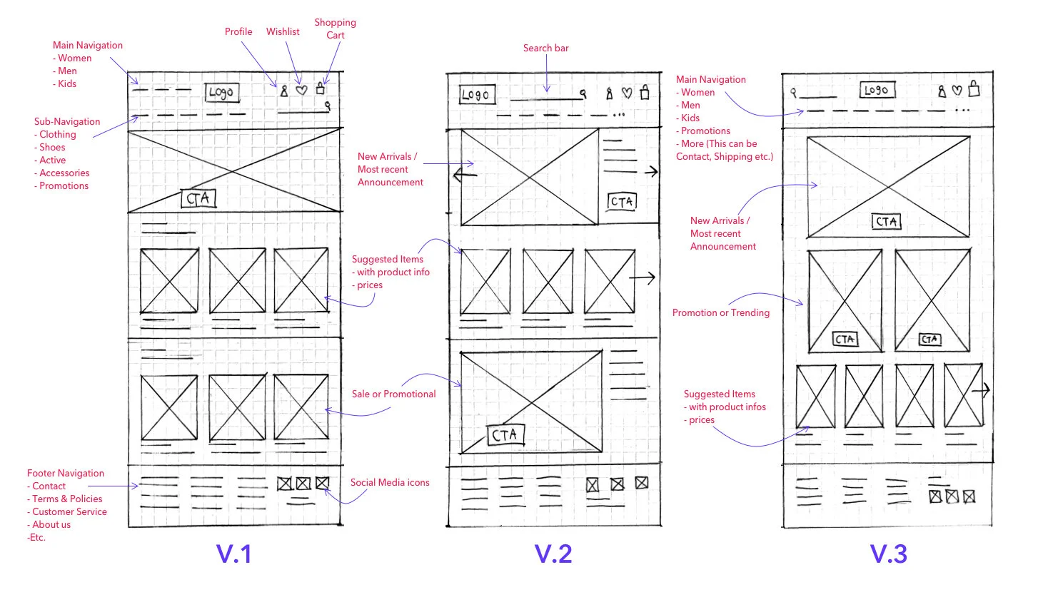
Low Fidelity Sketches
After coming up with the product feature lists, I have come up with 3 versions of the desktop design for the website. I have learned that it is essential to design the product from a larger device format to smaller ones, and coming up with more than 1 version then helped me along the process for creating mid-fidelity wireframe.
Sitemap
Before beginning to transform the low-fidelity wireframe into mid-fidelity one, I needed to have more details of the website navigation. Creating a sitemap allowed me to be able to plan out how the website should be laid out. I have tried to make the sitemap to be laid out as simple as possible because I needed to make sure that the MIRROR website would turn out as user-friendly as possible. I also have applied additional competition research to support MIRROR Sitemap creation.

View Full-Size
Interaction Design
User Flow
Plan out the Shopping Experience
To see how the website navigation would affect the user’s experiences, I created this user flow to understand the steps of how a user would navigate through fashion e-commerce and also how his shopping experiences would turn out in different case scenarios. It is an essential step in designing the product as we can make sure if the website navigation would not be confusing for users.

Mid-Fidelity Wireframe
To design a structure of the MIRROR website, I have utilized low-fidelity wireframes, product roadmap, sitemap, and user flow to help with creating the mid-fidelity wireframe. I have created wireframes of the pages that are the most prioritized based on the user-flow. I also have applied further competitor research to help with the inspiration for improving the wireframe design along the creation process.


Responsive Wireframes
As the most important goal in this project is to design the responsive website, I have completed the mid-fidelity wireframe first. As my mentor has approved the design of the desktop wireframe, I moved to one smaller device.

Mid-Fidelity Prototype
Along the way, to test out the design usability, I have transformed the mid-fidelity wireframe into a prototype. The Mid-fidelity prototype is a great way to test out the design structure. At the same time, it gives flexibility for a design to be able to come back and improve the mid-fidelity wireframe. The only downside is that Mid-fidelity prototype doesn’t feel as realistic as the high-fidelity.

Mood board
The Mood board is an important process of branding and UI design. As I have learned about the target users for the MIRROR are both female and male millennials who are based in Europe. I was able to figured out the aesthetic and fashion trend that would suit the current era. The theme that I went for is something modern, sophisticated, yet simple because I understand that the target users are young professionals. They are looking for clothes that they can wear for all occasions, including for professional events.

Logo
Design process
After I have come with a conclusion that I wanted with a simple and sophisticated theme for the brand, I decided to create a letter-based logo where I would use only serif fonts for the logo design. Along the process, I have tried out different fonts and experimenting with the logo shape by rearranging the letter positions. In the end, I decided to use a simple thin serif font for the MIRROR logo as I could imagine that this logo would be easy to recognize and also would look good on the physical product tags.
Final Logo Design
Style Tile
Behind the decisions on putting together the style tile for MIRROR is based on the underlying psychology and empathy for MIRROR target audiences. The target users of MIRROR are both Men and Women as Millennial - Gen X Professionals.
Since the MIRROR is offering low-price, but a high-quality product, the style tile of MIRROR has to present its image carefully. Users may have a higher expectation on the brand that High-Quality = Materials, External Style, and Sophisticated Brand Image - All combine.
That is why I came up with specific style as below. But over-time, the style needs to be update depends on the major fashion trend.
UI Kit
After coming up with a style guide that was surely suitable for the website UI, I put up all the design elements that I believed that would be applied on to the high-fidelity design of the website. UI Kit helped the high-fidelity design process efficient and organized as it worked as the firming design system for the designer.

Responsive UI Design
To be able to see how the UI elements that I was preparing on the UI Kit would be suitable for the design, I put the elements together over the mid-fidelity wireframe. I have made some changes later to the elements depends on the sizes, colors, and contents that I put on to this design process.
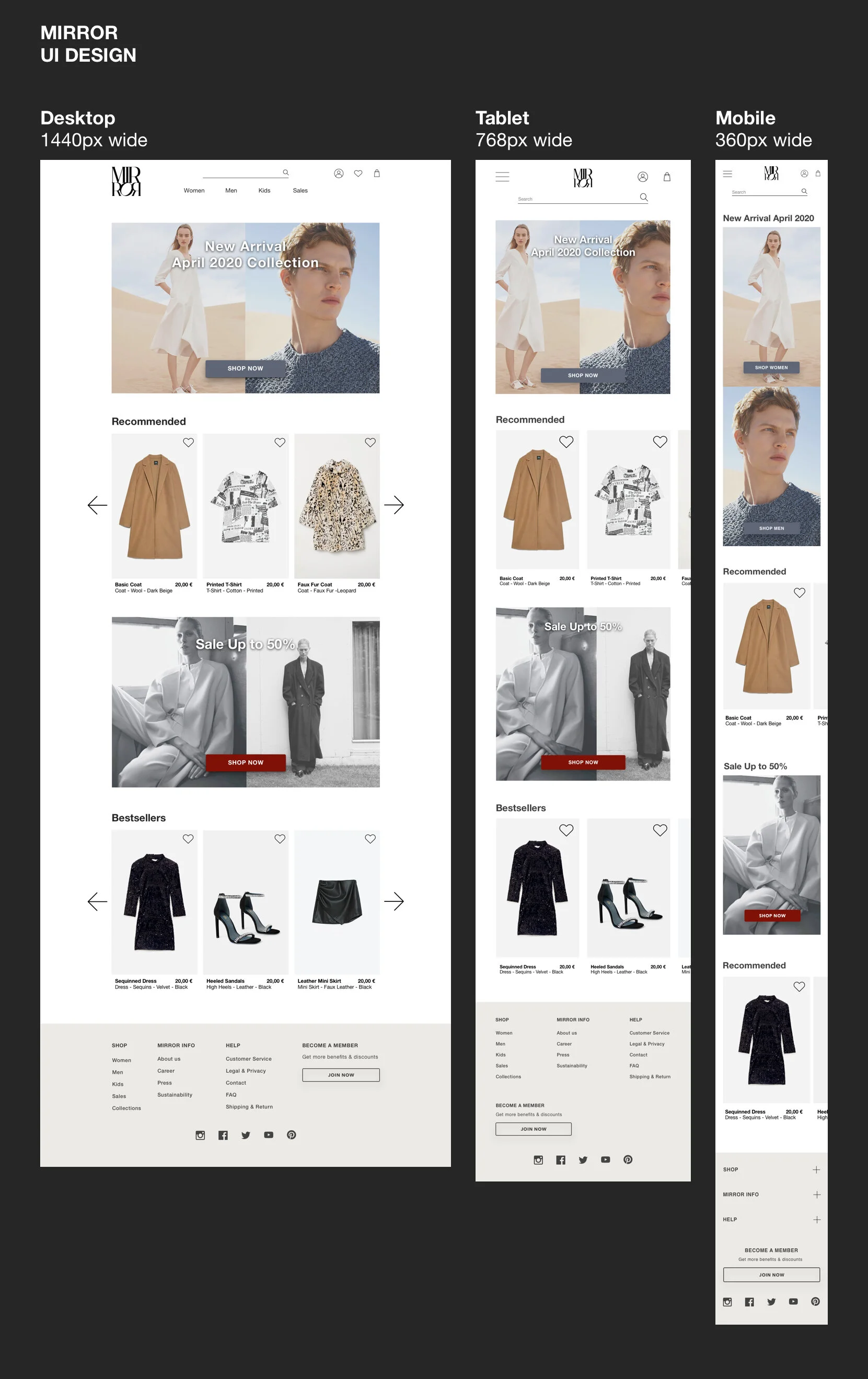
Photo Sources:
ZARA
C.O.S.
H&M
Holiday Magazine Autumn Winter 2017 Lachlan Bailey
Iteration & Implementation
High-Fidelity Prototype
After I became sure about the UI Design system for the website, I was able to create realistic prototype version.
High-fidelity prototype is a great tool to test the product to target users while they would get the most realistic feels during the testing.

Usability Test
Although, I have created two versions for the desktop prototype. I used the first version for in-person testing with 3 participants within the same day. However, one day after the testing, three participants have given me additional feedback on their experiences of using my prototype. I have learned that even though I have encouraged my participants to express their feeling and opinion during the test was not enough. Following-up questions are crucial for the design's improvement.
participant
3 Persons
Age 27-28
1 Female and 2 Males
Average Testing Time: 2-3 Minutes per person
Test Method: In-Person
Location: Zurich, Switzerland
Tasks
Add a pair of black high heels to your wish-list.
Filter and Find men's business white-collar shirts (Size L)
Go to wish-list and add high heels in size 39 and Business shirt in size L to a shopping bag and finish the checkout.
Test completion rate
Goal: All participants has completed all tasks Participant 1: 100% Success
Participant 2: 100% Success
Participant 3: 100% Success
error free rate
All participants needed some assistance, but they have quickly learned to solve the minor error by themselves. The participants didn’t experience major errors that would stop them from completing the task. Although, Participant 3, has experience a minor confusion that delay the completion.
Participant 1: 100%
Participant 2: 100%
Participant 3: 90%
This prototype is the first version (Not the Final Version)
Affinity Map
This Affinity map is the collection of information from the usability result note that I organized them into a different section. This way, it helps me to spot out the real issues within the design. It helps me to prioritize what I should improve and even to understand if the participant’s reactions were valid for the design improvement or not.

Priority Revision (Final)
About the latest adjustment
After reviewing the affinity map, I have made adjustments based on the consideration and discussion with my mentor on how I could improve the desktop design. Then, I decided to design the high-fidelity prototypes for tablet and mobile as well after the desktop prototype's adjustment. I use the design of the larger device as the base for the smaller ones for the design consistency. Yet, the smaller devices still hold their special elements that were specifically designed to suit their sizes.


Summary
Since the MIRROR is my first UX design project that I started. This project gave me a lot of learning curves for me as I learned how to design a digital product from nothing. Research was the most helpful phase that helped me to learn how user-friendly e-commerce could be designed.
The challenges during this project occurred during the research phase and the prototyping phase, where I had struggled with timing. It was a delay in learning new things while trying to accomplish work outcomes. I learned to manage time and prioritize tasks better while expecting to produce high quality effectively and efficiently.
Although most fashion e-commerce sites have very similar design patterns, and users may expect the design to be simple and familiar for them. I still wish that MIRROR could have more testing and the UI style might would have to be updated over time as it is crucial for fashion related business needs to have an up-to-date or fashion forward aesthetic.

https://undraw.co/
