
Google Map
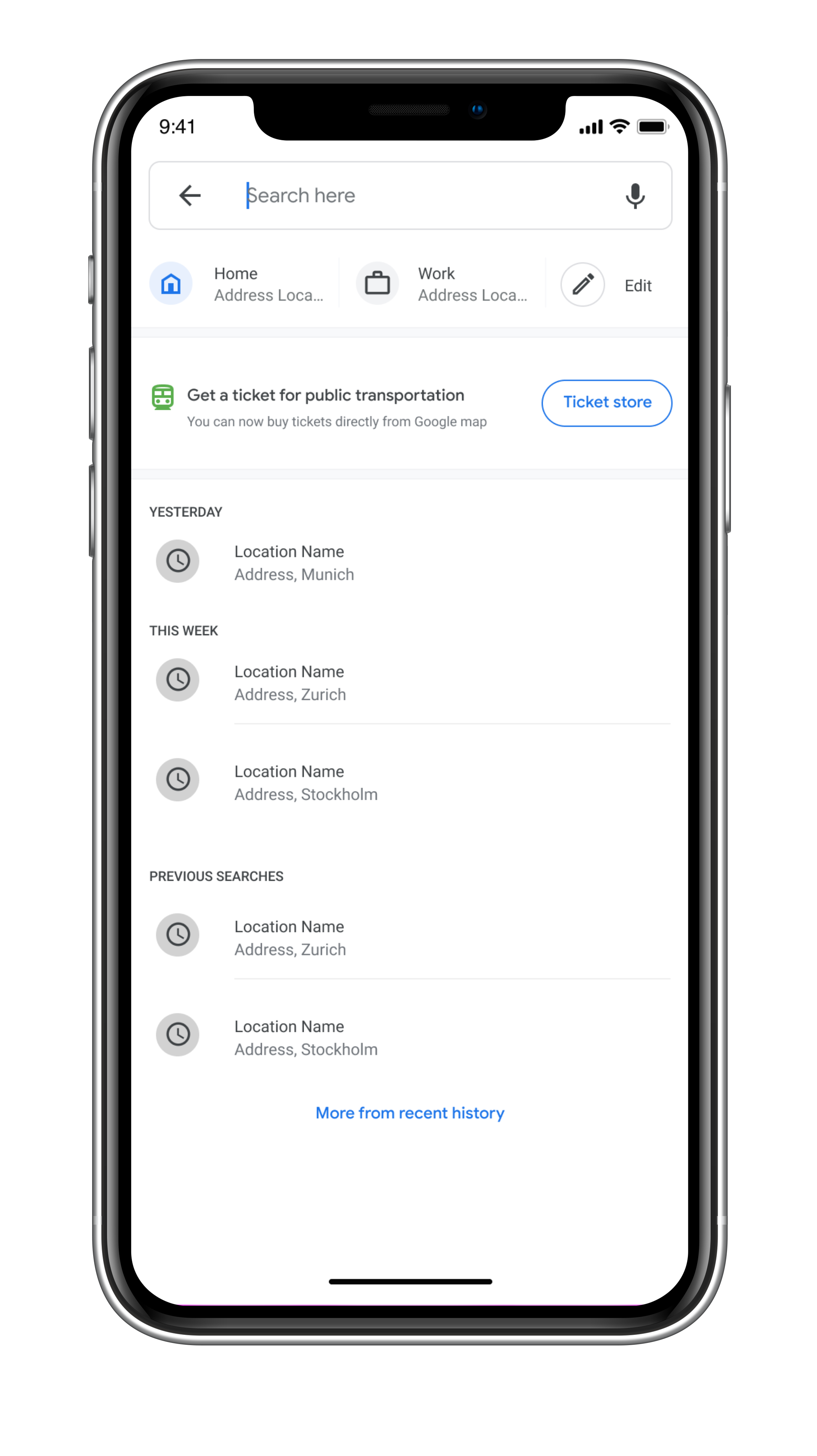
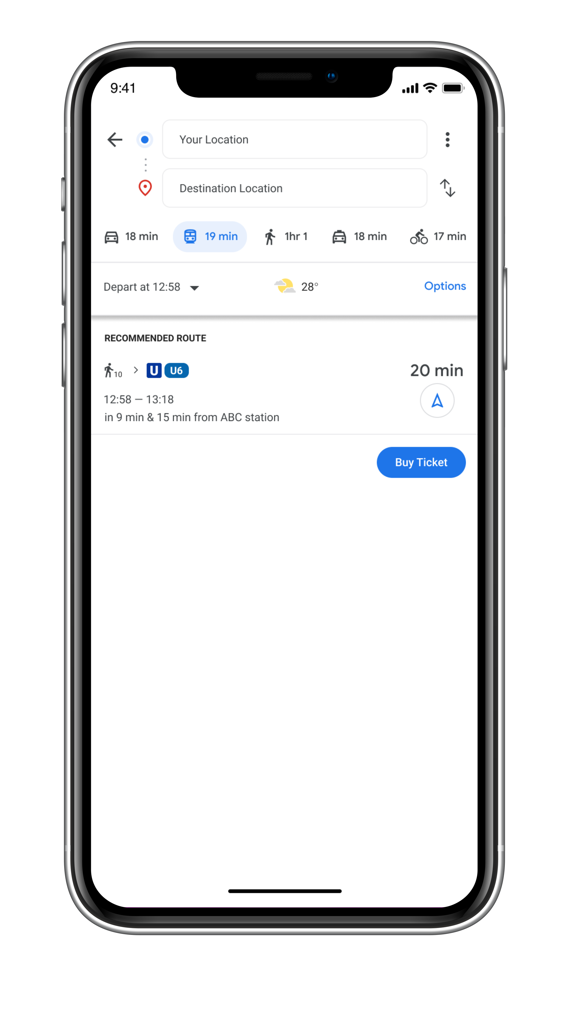
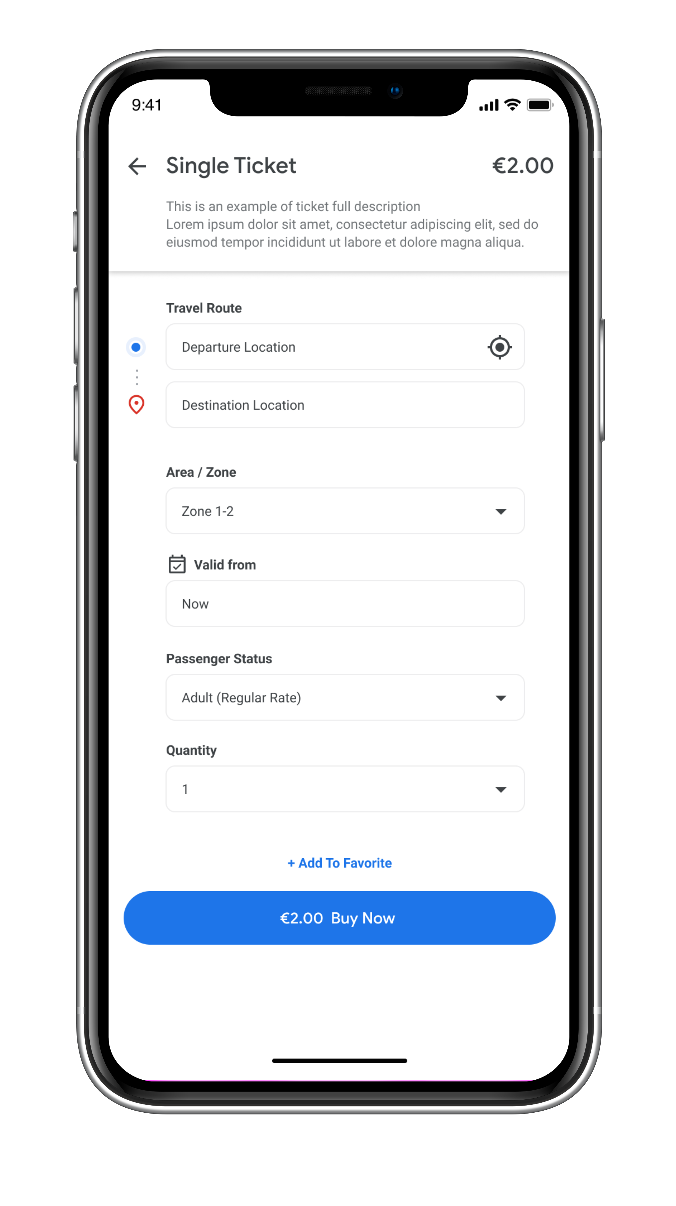
Public Transportation Ticket Feature | Allows users to buy public transportation tickets directly within the Google Map app

Allows users to buy public transportation tickets directly within the Google Map app
Challenge
WHAT DOES THE COMPANY WANT?
I am working on google Germany’s quarter, and the company came up with a project to design a new feature for the users to able to purchase tickets for public transportation around the world. For now, the company wants me to design this feature to be suitable for European public transportation. (Fictional case scenario)
REASONS TO DESIGN
Google noticed that many users are relying on the Google map when they are traveling using public transportation in Germany. However, different cities in Germany have separate apps for online ticket purchases, and it is an opportunity for Google to make online tickets easily accessible for everybody traveling and locating in Germany. This will also encourage people to use more public transportation, which is a more sustainable way to travel around the city area.
Background
Google Maps is a web mapping service developed by Google. It offers satellite imagery, aerial photography, street maps, 360° interactive panoramic views of streets (Street View), real-time traffic conditions, and route planning for traveling by foot, car, bicycle and air (in beta), or public transportation. In 2020, Google Maps was used by over 1 billion people every month.
Google Maps first started as a C++ program designed by two Danish brothers, Lars and Jens Eilstrup Rasmussen, at the Sydney-based company Where 2 Technologies. In October 2004, the company was acquired by Google Inc. Then The Google ma wasp first launched on the Google Blog on February 8, 2005.
Google Maps is available as a mobile app for the Android and iOS mobile operating systems. The Android app was first released in September 2008.
Goals & Objectives
Design a new feature within google map app (For mobile)
Research on Competitor’s products
Research and study on local public transportation apps (How the ticket system works)
Test the feature with target users
Research if it is possible to add the feature into a smart watch
PROJECT DURATION
4 weeks
ROLE
UX&UI Designer, Researcher and Interaction Designer
TEAM
Chira Chirakijja (Me)
Paddy Donnelly (Support & Mentor)
STAKEHOLDER
Google Inc. (Only for a case study - Fictional Client)

Research Goals
How does the online ticket store work?
Who are the competitors?
What competitors do well and poorly in offering an online ticket store for public transport?
How does the public transport ticket system work in Germany / the EU?
How to design a feature for a smartwatch?
How do people use a smartwatch while traveling in the city?
Data Collection (Secondary Research)
To define the target user group for the Google Map's ticket feature, I began with secondary research by collecting data from the internet and from an observation of the people who would be most likely to buy public tickets via a mobile app.
Who are the users for the public transportation ticket feature?
From my observation and research, the potential group of users is:
1. Local Residents
2. Professional Expats
3. Tourists
The research has helped me to create the set of questions that reveal the motivations and wants of 3 different groups of why would the users want to use the Google Map's ticket feature instead of the existing method.
However, this data collection doesn't answer everything I needed to understand, so the data I have obtained was the part that helped me to plan out how I would conduct interviews with the target users.
Research on How to design a Smart Watch feature
Because I was interested in designing a feature for the smartwatch as well as the mobile version. I have collected some research data that would help me to understand how to design a feature for a smartwatch.
However, I have not prioritized to complete the smartwatch feature design due to the time limitation and my lack of experience in using a smartwatch.

Competitor Analysis
In order to understand how the public transportation ticket apps work, I have conducted a research on the competitor’s products. Even though, Google Map has become a popular app for users around the world, Not every cities/countries in Europe have the E-ticket system available. So, I have chosen specific major cities such as Munich, Berlin, Zurich, Vienna and Stockholm for the analysis.
Design Audit was a main method that helped me to learn the pros and cons of the ticket apps available in the 5 chosen cities.
The followings are the applications that I have analysed:
Munich, Germany (MVV App)
Munich, Germany (MVG App)
Berlin, Germany (BVG App)
Zurich, Switzerland (ZVV App)
Vienna, Austria (WienMobil App)
Stockholm, Sweden (SL App)
User Interviews
To understand what my target users feel about their experiences in buying tickets from both mobile apps and a physical machine, I have conducted a 1-1 interview with 3 participants who have met the requirement of the target user of this project. All of the participants were aged between 20-28 years old and had absolutely different backgrounds. All of them have different opinions about digital tickets and physical tickets. They also gave me a lot of insight about their frustrations and impressions about their local systems and reasons why they dislike or like a particular way of buying tickets.
ABOUT PARTICIPANTS

3 Participants
2 Female, 1 Male
Age 20 - 28 years old (Millennials)
All of them are Google Map users
All of them have experiences in using mobile apps for buying public transportation tickets
1 Participant has given up mobile app due to bad experience
1 Participant is natural about both physical ticket and digital ticket
1 Participant prefers digital ticket over physical ticket
Persona Creation
To define and empathize better with the target users, I utilized all of the research finding and interviews to create 2 personas. These personas represents the potential users for the new ticket feature.


Storyboard
A storyboard is a great tool to better empathize with the target user. We can see through the user’s possible experience and motivation that would lead him or her to use the product. The storyboard was made based on secondary research, observation, user-interviews, and persona creation. Not only as a great tool to empathize, but it is also a helpful way to communicate and present the benefits of the product to the stakeholder and a team.
Information Architecture
Product Roadmap
To start designing the new Google Map’s ticket feature, the product roadmap contains the lists of different priorities of the features that will be added to the product. I utilized the competitor’s research to helped me to create the list of the features.

Site Map
To design how the new feature navigates, this sitemap works in a manner that helps me to see how it would be possible to design the new ticket feature within the existing App. The Challenge is that the ticket feature would appear as the specialized function that should find its place among the existing main functions without disrupting what is already there.
User Flow
In order to learn how the sitemap would work, I created 3 usage case scenarios. Each scenario gave me a better picture of how a user would go through step by step. Not everything from the product roadmap and sitemap was able to fit into the design, so the user flow helped me to prioritize what necessary for the feature.
Low-Fidelity Wireframe Sketches
To create the design structure, I utilized the research findings, priority product roadmap, site map and user flow to help with the sketches. Competitor’s design audit has played a significant role in inspiring and showing me the useful design patterns that I could apply to the design. The advantages of low-fidelity wireframe are high flexibility to make adjustment, time-saving and sometime it gives organic sources of inspiration.
Interaction Design
Mid-Fidelity Wireframe
After finishing with the low-fidelity wireframes, I transformed the low-fidelity wireframe into the digital form. Mid-Fidelity Wireframes help me to determine the layout sizes, construct the product architecture, making design adjustments, and works as an outline for the next stage fidelity. Mid-Fidelity is a stage that lets me decide if the structure would be realistically suitable for the existing app.
I also made changes multiple times in the mid-fidelity wireframe to make sure that the new feature would not interrupt the existing functions.
UI Design
UI Kit
To create the high-fidelity design of the ticket feature, Google map already has a strict rule of the UI and style that a design must follow. Fortunately, Google is very transparent about their design materials and I was able to follow the exact design rule that Google Map has. I have created this simple UI Kit to help me to complete the high-fidelity design efficiently.

Material.io is the primary source that is run by Google inc. This website is where I found everything from fonts, design principles, and icons that have been used for designing Google Map app and also all Google’s products.

Iteration & Implementation
High-Fidelity Prototype
This High Fidelity Prototype is the version that I’ve used for the usability testing.

Usability Test
To measure the usability of the product design, it is essential to conduct the testing with the target users. It helps revealing weak and strong spots of the design which is great for a designer to know how he or she can improve the design. I used the first version of the high-fidelity prototype to test out with 3 testing participants who were previously interviewed on the early stage of this project.

TEST OBJECTIVE
To spot the features or elements that create fruition or confusions to the users
To observe how well users navigate within the platform and the app
To watch how much time users spend to finish the task
To find error and to improve the design to make it as user-friendly as possible
PARTICIPANTS
3 Participants
2 Female, 1 Male
Age 20 - 28 years old (Millennials)
All of them are Google Map users
All of them have experiences in using mobile apps for buying public transportation tickets
TASKS
Task 1: Find a direction to a destination (Google Building in Munich)
Task 2: Buy a single ticket for Munich public transportation
Task 3: Find a ticket wallet and find a valid day ticket for Munich
Task 4: Restart the prototype and buy a day ticket again without searching for a destination
COMPLETION RATE
Goal: All participants has completed all tasks
Participant 1: 100% Success
Participant 2: 100% Success
Participant 3: 100% Success
ERROR-FREE RATE
All participants were able to complete every task without needing any assistant except Task 3 (Finding a ticket wallet). All participants showed a slight delay and confusion at finding a way to a ticket wallet that is hidden in the Saved Page.
Participant 1: 90% Success (showed a delay and needed an assistant to find the ticket wallet)
Participant 2: 100% Success (was slightly delayed at finding a ticket wallet but didn’t need any assistant).
Participant 3: 90% Success (was confused and needed an assistant to find the ticket wallet)
TEST CONCLUSION
All participants showed high confidence in searching for a destination and high confidence in buying tickets. All of them said that the ticket feature is very simple to use, especially the buying process. However, all of them showed the sign of confusion and delay at finding the way to a ticket wallet feature by starting at the Explore page.
I assumed that with the limited navigation options that already existed within the Google Map. All of them didn’t understand the Saved Page and didn’t expect the ticket wallet to be there. I assumed that it is crucial to have a short cut that would allow users to be able to find the ticket wallet without having to remember where to find it. All the users were able to quickly find the ticket wallet via the ticket confirmation page by clicking the “Go to my ticket wallet” Button.
Affinity Map
To spot out the real issues within the design, I created this affinity map that works as a collection of information from the usability result note. It helps me to prioritize what I should improve in the design and how to understand if the participant’s reactions were valid for the design improvement or not.
Priority Revision
After gathering the test results and considering further improvements, there are things that I have to work on for the next step:
Improve the Checkout by adding Sign-in Option
Add more payment methods
Considering the a short-cut for users to access the ticket wallet


Summary
This Google Map’s Ticket feature project is my third UX study case that I planned and organized by myself, with some consults from my mentor. This project was inspired by my own experience as a person who lives in an urban area and been using a public transportation. Usually, I use a mobile app that is available in Munich to buy a public transportation ticket. However, every cities has their own application and it is impossible for me to always buy a ticket from a mobile phone when I travel to different cities.
The issue that I have faced when buying a public transportation ticket in different cities is that it can be annoying to always need to re-learn the unfamiliar system in different places. When it comes to Google map, the app works as the most trusted universal mobile app when people travel to different cities, so this gave me a question “I use Google Map all the time, why can’t I just buy every ticket from here too?”.
Since most people and including me are using google map every time when we want to use a public transportation, I came up with an idea to design a feature in Google Map that would allow users to buy public transportation tickets for everywhere they go!
Along the design process, I have learned more about Google's design principle and also the flaws in its product like Google Map. The challenge that faced during the process is to design a specialized feature to an app that already has a lot of functions. To avoid cluttering the interface while making sure that the feature has good usability is something that I focused the most. I had to accept the fact that the feature will not be as perfect as I expected. There was some minor usability issue that I could not solve entirely. But instead, it allowed me to find an indirect solution for a particular issue without making any changes to the existing design.

Sed diam nonummy euismod tincidunt ut laoreet dolore magna aliquam erat volutpat.