
Automata
Robot Maintenance App | Automata app gives users the ability to easily maintain and control over their personal robot

Automata app gives users the ability to easily maintain and control over their personal robot
Project Background
The mega robotic company called "AUTOMATA" has a plan to launch a new high-end security robot that would replace humans in the military, police operation, and security-related positions. The robot is also designed for private owners and business entities who wish to replace this new, highly durable, skillful, and intelligent robot over human workers.
AUTOMATA company wants me to design a user-friendly mobile app that allows users to maintain the robot and even customize the robot's system setting.
Concept
The idea of this project is to design a mobile application for a personal robot's maintenance. This project is a fictional project that will take place for a possible case scenario in the far future when robots become highly developed and wholly integrated into our everyday lives.
In the soon future, there might be many kinds of robot working in different careers. And with this idea, I wanted to design for a product that would allow a user to interact with robots.
Let's assume that personal mobile phone would still be used in the far future. Users would still need to be able to take full control over these highly advanced robots and be able to give them maintenance easily through a mobile app.
PROJECT DURATION
4 weeks
ROLE
UX&UI Designer, Researcher and Interaction Designer
TEAM
Chira Chirakijja (Me)
Paddy Donnelly (Mentor)
STAKEHOLDER
AUTOMATA Robot Company (Fictional Client)
Goals & Objectives
Design a user-friendly robot maintenance mobile app
Research on the existing maintenance mobile apps (Example. Cars' maintenance app)
Research on the existing AI mobile applications
Design the maintenance setting that makes users feel in control.
Design a new logo, style tile, and UI
Define the possible target users
Test the product

Research Goals
Data Collection
Gather informations about machine maintenance apps and AI/ Robotic related apps.
How these apps work? Who would mostly be the target users?
What kind of concern would people have for robots and AI?
Design Audit (Competitors):
Which companies have a car or machine maintenance mobile apps?
Which Robotic and AI apps can I learn from?
PRIMARY RESEARCH
User Interview: To empathize and understand how target users would think about the possibility at using a mobile app to maintain and control their security robot.
Participant requirements
Both Male and Female
Age from 20 - 40 years old
Interested in artificial intelligence and robots
Have experience in using any kind of AI assistant like Siri, Google Assistant, Bixby and Etc.


Data Collection (Secondary Research)
To find inspirations and information that would support the project, I was researching how today's robotic inventions could inspire me about the project. The existing AI products that we already know (Siri, Google AI, Alexa, and Bixby), they are giving some basic guiding of why they have become accessible to users. To study about today's AI, helped me to be able to create a set of questions that I was using for user interview. I found out that the reality of personal robot integration is not so far away in the future. This helped me to be able to create further questions of "How do I create a system or product that would help users control their robots and AI easily?"

User Interviews
To find out more inspirations and understanding more about users who have experience in interacting with today's AI and robots. I conducted user interviews with three millennial participants who are the frequent users of AI products and including a home-robot like a vacuum robot.
Despite the project's concept is very fictional and is taken place in the future scenario, the insights from the interviews helped me to understand their wishes and concerns in AI and robotic products. Also, they were sharing ideas that helped me to learn how it was possible to start designing the robot maintenance app.
ABOUT PARTICIPANTS
3 Participants
3 Females based in USA
Age 20 - 28 years old (Millennials)
Have Smartphone device and any AI or robotic products
Have experience in using any kind of AI assistant like Siri, Google Assistant, Bixby, Alexa and Etc. Owning a car is plus.
Are interested in robots and Ai concepts
Interesting Insights
When it comes to interacting with AI, all user’s big concern is privacy.
All users feel that AI can be unpredictable in their behaviors.
All users agree that they would like to feel a sense of control if they would own a personal robot.
One user claimed that she would prefer to communicate with the AI products by texting more often than a voice command.
All users feel that they want to be able to personalize their AI/robotic products.
One user felt frustrated that her AI can only understand one language at a time.
All users agree that all personal robots should have an app or tool that would allow them to control and keep track of the robot.
All users have a slight fear for AI and robots but still admit that they want to own a personal robot.
All users think robots should look friendly and cute, to enhance their sense of safety. (And robots shouldn’t look too much like a human)
Persona Creation
To define and empathize better with the target users, I utilized all of the research findings and interviews to create two personas. These personas represent the potential users who would want to use a robot maintenance application to keep track of his/her robot. This persona creation has been inspired not only based on the project research, but it has been inspired by my observations from sci-fi films as well.
So I have created two personas who have different concerns and needs when it comes to owning a robot.
About the personas
Victor: Is a private user who purchased and owned a robot for his reason. He has concerns and needs for himself and his family.
Sarah: Is a police officer who only works with a police robot that is owned by the government. She has concerns and needs mainly related to her works and the safety of civilians.


Storyboard
A storyboard is a great tool to better empathize with the target user. We can see through how the app could integrate into the user’s experience. The storyboard was made based on secondary research, observation, user-interviews, and persona creation. Not only as a great tool to empathize with the possible target users, but it is also a helpful way to communicate to the stakeholder and the team to help them understand the possibility of the app existence.

Information Architecture
Product Roadmap
To start designing the new robot maintenance app, the product roadmap contains the lists of different priorities of the features that will be added to the product. I utilized the all my research collections and the list of functions that we have already used for organizing our life.

Site Map
To design how the new robot app, this sitemap works in a manner that helps me to see how it would be possible to bring the features from the roadmap list to fit into the design structure of the app. The challenge is that I had to prioritize the essential functions that would be necessary for the users to feel in-control while keeping track of his/her robot. I decided not to over-add the features to prevent the app from becoming too complex for the users. While the same time I try to balance the number of features that I put into the app to make the app becomes truly useful and functional.


User Flow
In order to learn how the sitemap would work, I created 3 usage case scenarios. Each scenario gave me a better picture of how a user would go through step by step. Not everything from the product roadmap and sitemap was able to fit into the design, so the user flow helped me to prioritize what necessary for the feature.

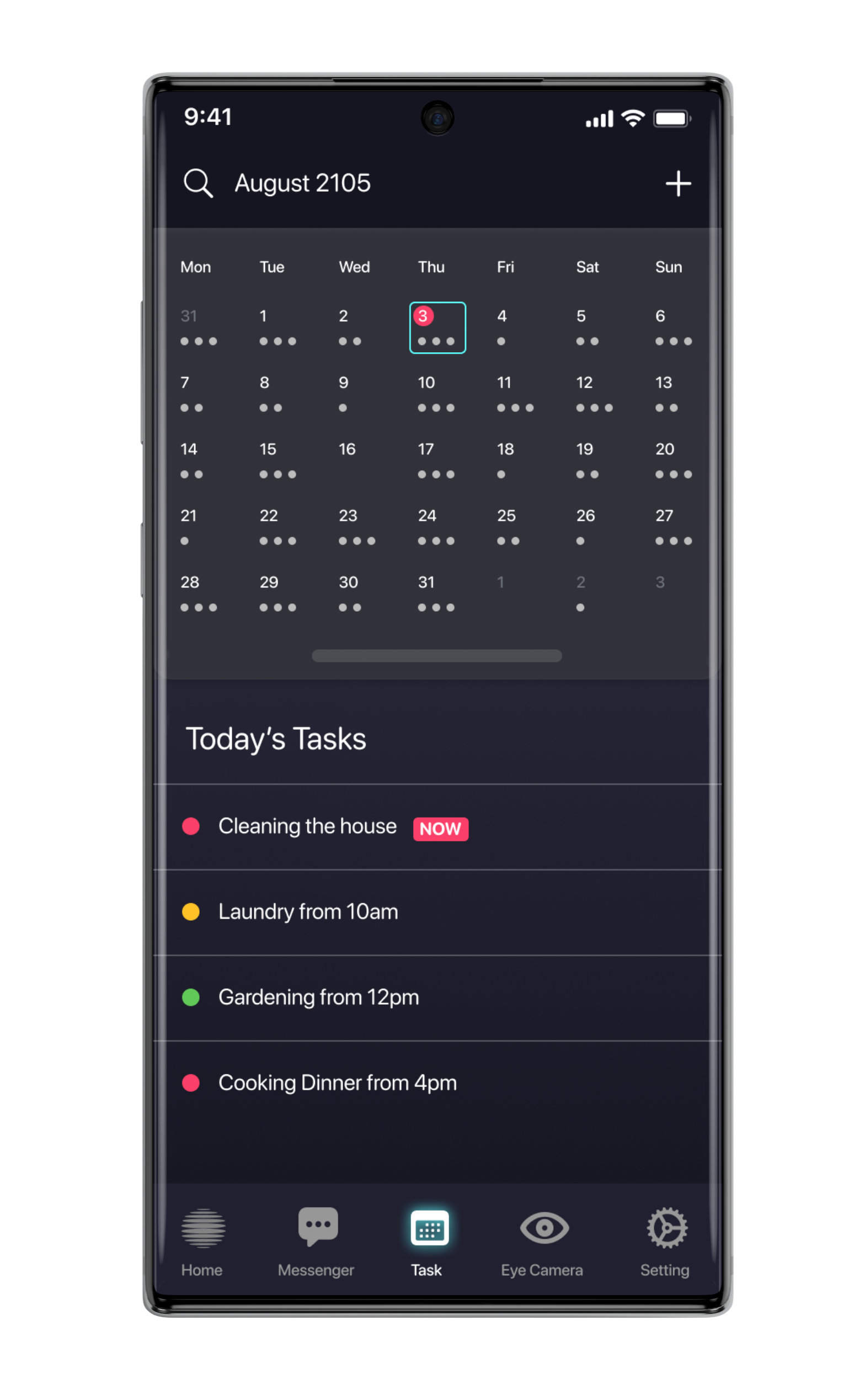
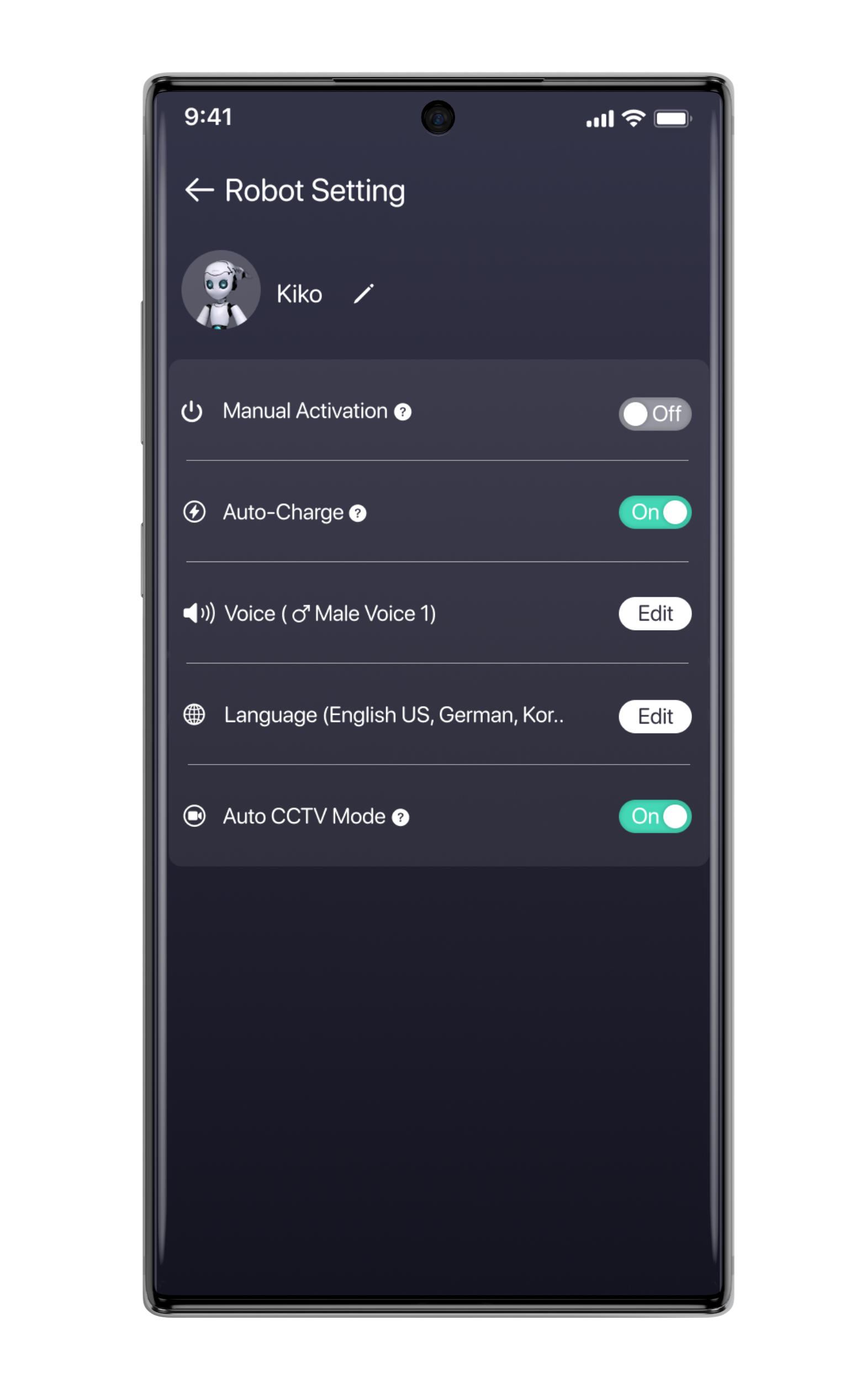
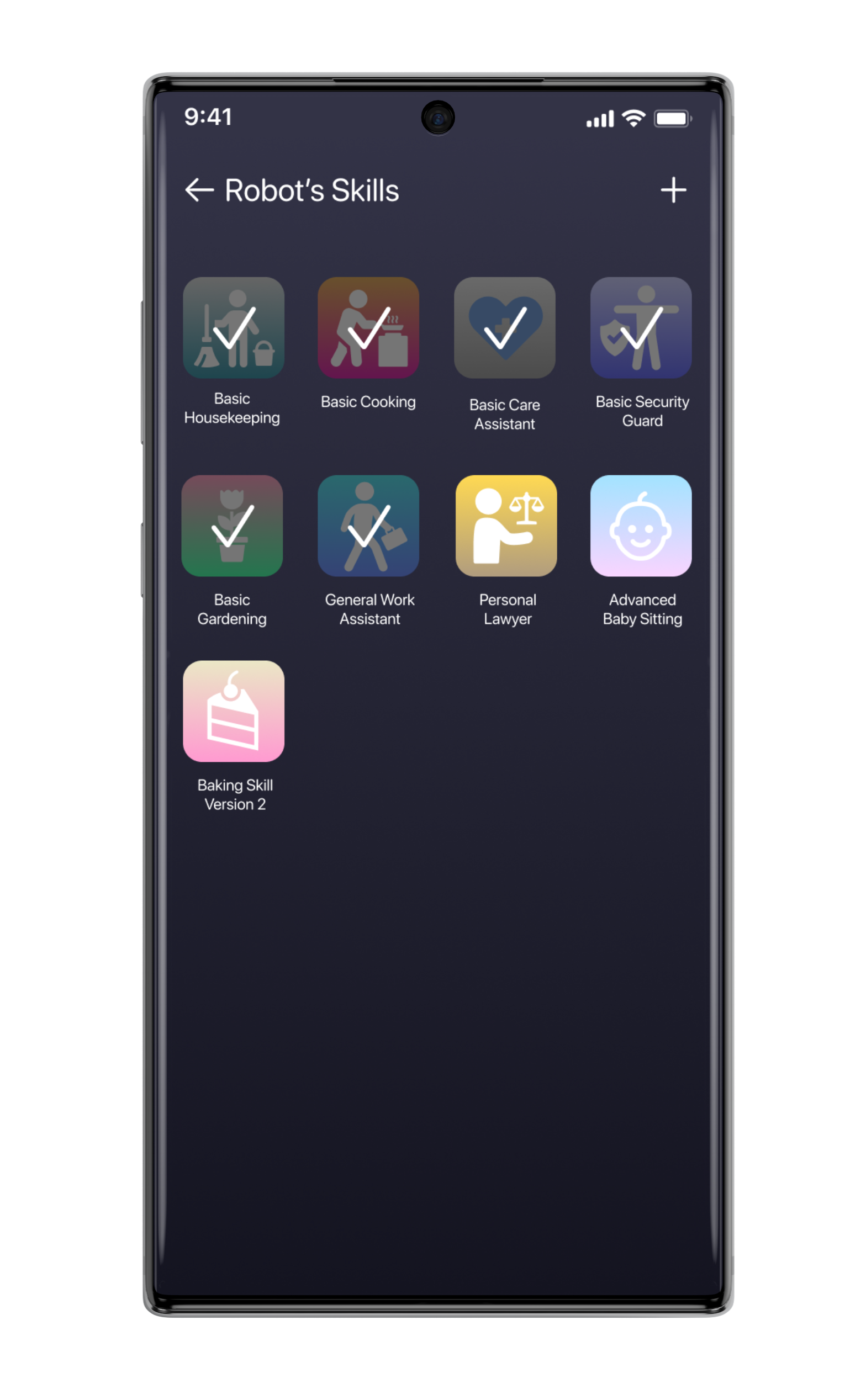
Low-Fidelity Wireframe Sketches
To create the visual structure of the product, l utilized the product roadmap, sitemap, and user flow to help me with the sketches. I also obtained inspirations from our everyday applications and products such as text messager, calendar app, app store, camera app, and RPG gaming experiences to help with different features of the design. To make the design turn out as user-friendly as possible, I carefully picked the design patterns that I believe are the most common and familiar for most of today's users.
However, I used Low-fidelity wireframe as the first draft of the idea of how the product would be built. I transformed the low-fidelity into the digital version (Mid-fidelity version) to have a better look at how I could improve the wireframe further.
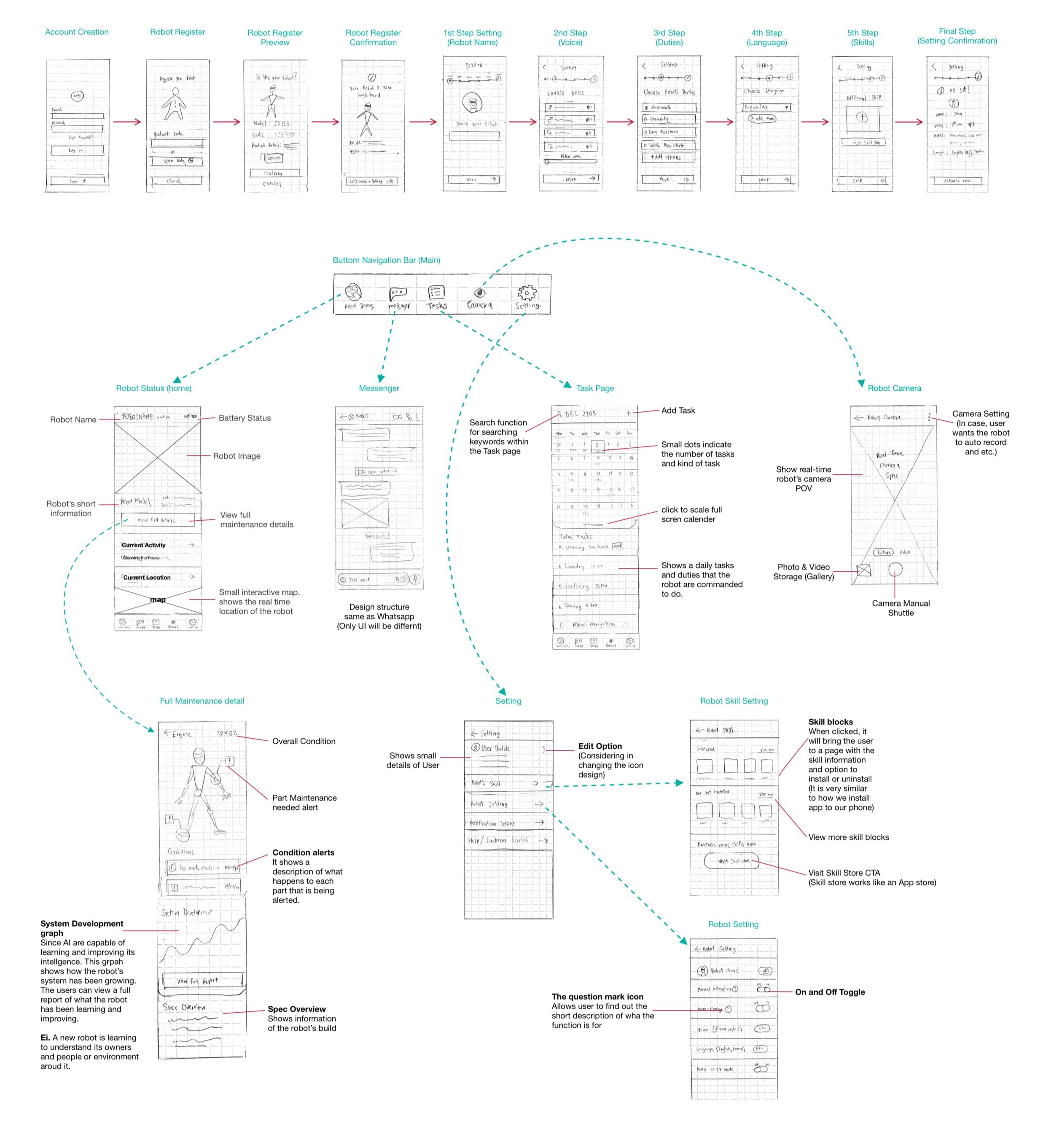
Click to view full-size
Interaction Design
Mid-Fidelity Wireframe
As I transformed the low-fidelity wireframe sketches into a mid-fidelity wireframe, I have made changes in terms of elements and layout. I have re-ordered the element layout and re-prioritized what’s essential in each feature. The major transformation from the low-fidelity version into this mid-fidelity wireframe is the “Home screen.” It is where I simplified the essential features into one simple screen function.

Click to view full-size
Mood Board
To create the visual style for the product’s UI, I started to gather inspirations since I began the project very early on. What I have learned to develop an effective and solid mood board for UI is that it was the right thing to start very early on when the idea was still very fresh. What I see is that Moodboard usually needs time to develop, and it should not be something to rush.
What I did was that I first gathered images into one single random category, and afterward, I created more different segments for re-selecting the references into specific categories.
After the moodboard became solid enough, it has helped me to save a lot of time at creating style-guide, UI Kit and logo design. It is important for designers to be sure enough about the style that he/she will be creating.

Logo Design
As the project is an organic fictional idea that needed to have a new brand-image. I tried to come up with the logo that would suit the style that I have come up with the mood board. It has been a big challenge to design an iconic logo for this project as I have learned that logo design usually needs a lot of time and a lot of experiments. Sometimes the logos required references to help with inspiration, but it still can turn out un-iconic or even too unoriginal. Occasionally a designer herself/himself may not have a full ability to create what exactly they want.
For my logo design process, I have been experimenting with oval, circle shape, and 3D effects on the Illustrator. However, since the timing was limited, I decided to use a sphere shape with the flat ovals stacking together as the project's logo. However, before I wanted to use another design of the blob-shaped sphere but it still looks too similar to the original reference, and I decided not to use it at all due to the copy-right concern.
Final Logo


Logo design experiment by laying out shapes

3D Revolve Effect Experiment on the Illustrator
For the font logo, I didn’t design it by myself, but I chose to use the existing sci-fi font that is available for non-commercial use.


Style Guide
To create a solid style for the UI, the work has to be done in the mood board. After I created a solid mood board that I am satisfied, I re-selected the images that believed would be the primary representation of the UI Style that I wanted to go for.
I got inspired by the colors and visual effects that the references hold. I created the color palette based on the image elements, while I was also considering adding more colors that were only useful for specific functions and enhancing accessibility.
The approach that I have for the UI style guide is that I usually keep the style guide slightly flexible and easy to be changed. I still believe that in most cases, designers must be strict with following style guides. But I do not think that styles should not always stay the same due to the changing style trend. UI Styling is essential at creating a sense of connection to the users and evoking their positive emotions such as “Welcomed,” “Secured,” “Friendly,” “Up-to-date,” etc.

UI Kit
After careful consideration of the style guide, UI Kit is a tool that I usually keep things strict and precise. I see UI Kit as a tool that allows designers to follow for their projects without having to make more changes in terms of UI style. It is different from the style guide, as it is something that designers use for working together as a team. Designers can quickly pick the elements to apply to the high-fidelity design of the product without having to worry about being unsure about the given style for the UI.
Before I decided that UI Kit is ready, I normally try apply to elements together on the wireframe and then making final decisions on what colors, shade or element style I really want to stick with through out the whole project.

Iteration & Implementation
High-Fidelity Prototypes
After I became sure with the UI Kit style that I wanted to stick with, I have applied elements from the UI kit into the duplication file of the final mid-fidelity wireframe. Usually, I do not make any such changes in the design structure with high-fidelity, unless necessary.

First Version Prototype
Above is the first version of the high-fidelity prototype, where I decided to make more changes in terms of robot visual representation. What I realized was that visual presentations and even colors can evoke the user’s sense of connection to his/her product.

Robot representation
However, I changed the robot presentation from manly looking one into a more soft and friendly-looking robot. As I have discussed with my mentor that the orange robot quite appears too intimidating and scary. And the purpose of this project is that to crate the sense of control and safety for users to interact with his/her robot.

Final Version Prototype
After making a change with a robot representation, I decided to add more screen functions to the prototype by choosing to create more screens that serve the main important tasks that the users would mostly want to use. I tried to make the prototype feels as realistic as possible for a usability test.

Different themes for user’s personalization
Since I was well aware that I want to make sure users would feel personalized and connected to the robot, I added an option for users to change app themes.
I came up with another three different themes that I believed would evoke a sense of friendliness while considering the readability of the themes.
These themes were inspired by Japanese sci-fi kind of aesthetics. I tried to keep the theme cute and fun yet feels high-tech.
Robot image references:
Orange Robot (https://elementza.com/)
Main White Robot (Chogokin Drossel Action Figure)
White Small Robot (Musio Robot)
Usability Test
To measure the usability of the product design, it is essential to conduct the testing with the target users. It helps revealing weak and strong spots of the design which is great for a designer to know how he or she can improve the design. I used the final versioned high-fidelity prototype to test out with 3 users.
Participants
3 Participants
2 Females, 1 Male
Age Mid 20s
Test Method: In-Person (with Figma Mirror) and Remote Test
2 Participants were new to the project
1 Participant was recently interviewed for the project
Test Objective
To spot the features or elements that create fruition or confusions to the users
To observe how well users navigate within the platform and the app
To watch how much time users spend to finish the task
To find error and to improve the design to make it as user-friendly as possible
Completion Rate
Goal: All participants has completed all tasks
Participant 1: 100% Success
Participant 2: 100% Success
Participant 3: 100% Success
Tasks
Task 1: Register a new robot
Task 2: Understand how to navigate the app and understand how every feature works
Task 3: Install a new skill for robot
Task 4: Change the app theme
Error-free rate
All participants were able to complete every task without needing any assistant except Task 3 (Finding a ticket wallet). All participants showed a slight delay and confusion at finding a way to a ticket wallet that is hidden in the Saved Page.
Participant 1: 90% Success (showed a delay and needed an assistant to find a skill setting screen)
Participant 2: 100% Success
Participant 3: 100% Success

Affinity Map
To spot out the real issues within the design, I created this affinity map that works as a collection of information from the usability result note. It helps me to prioritize what I should improve in the design and how to understand if the participant’s reactions were valid for the design improvement or not.

Priority Revision
After gathering the test results and considering further improvements, there are things that I have to work on for the next step:
Adding short-cut to Skill Setting Screen
Adding Device-syncing setting function
Spelling Error Check
Considering at adding more themes that has a good accessibility for users with poor eye sight.


Summary
This project is my UX case study project that I have came up with and planned by myself. During the project, I got my mentor as an advisor throughout the whole process.
The original idea for this project has come from my fascination with artificial intelligence and robots. I wanted to try to design a mobile app for a personal robot that has not existed yet. I started it without a doubt as a way to challenge myself to learn further beyond what I understood about UX design.
The big question that I had for the whole time was, “How do I find inspirations of today’s era that would inspire me to design the product of the future?”
This project is one of my most favorite projects that I have ever done as it allows me to use a lot of creativity and observation of all experiences in our everyday lives. I got to learn more about A.I. and to find inspiration from sci-fi films and my gaming experiences.
This project has revealed plenty of secrets of how people do feel about this new technology. As I have spoken to more people, I realized that we already have robots working for us, and A.I. is everywhere from the search algorithm, the text messenger, forecast, GPS navigation, etc.
The greatest lesson that this project taught me was that it is absolutely possible to design a very simple user-friendly product of something that doesn’t yet exist. User experience is like picking an existing design pattern and apply it to the right purpose. After testing the prototype, it was a great success that I had received a lot of positive reactions and a high error-free product testing rate.
I also showed the prototype to another more of 10-12 people as the non-official usability testing; many users have expressed excitement and joy about the app, which made me very happy to that they had fun and said “Now I want to have a robot too!”.

Sed diam nonummy euismod tincidunt ut laoreet dolore magna aliquam erat volutpat.